Macrometa’s platform was powerful, but new developers were left to work it out on their own, and many turned to support or left. With our Head of Design, I refreshed the platform’s interface, and I led a new onboarding built on templates, sample data and tutorials. Customer retention rose 54%, and support tickets fell 55%.
Role
Product designerUI refresh with the Head of Design. Onboarding and activation, led by me.
Team
Head of Design, Head of Product and engineers
Timeline
3 monthsThe first three months of 2022
Status
Shipped
Click any image to see it full size.
At a glance
The problem
Macrometa could do a lot, but new developers were left to figure it out alone. They dropped off or turned to support.
What I found
Three gaps: no real onboarding, nothing to help developers of every level get started, and an interface that wasn’t consistent.
The ideaTurning point
A clearer, consistent interface, and a guided start, so no developer has to figure it out alone.
What shipped
A refreshed interface across the platform, with our Head of Design. And a new onboarding I led: a clearer sign-up, a welcome with next steps, and empty states and sample datasets so nobody starts from nothing.
Results
+54%
customer retention
−55%
support tickets
73%
faster sign-up completion
$2M
revenue that year
Powerful, but on your own
Macrometa is a cloud platform for building fast, global apps and APIs. It could do a lot, but it showed new users very little of it. There was no real onboarding, the interface wasn’t consistent, and support tickets were piling up on the customer success team. People dropped off, and customers left.
Customers said it in their own words:
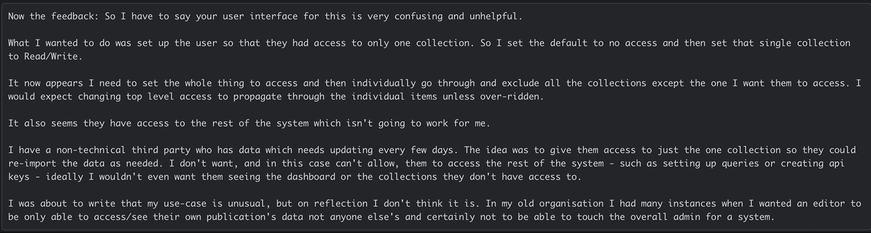
“I have to say your user interface for this is very confusing and unhelpful.”
Customer, setting up access for a teammate
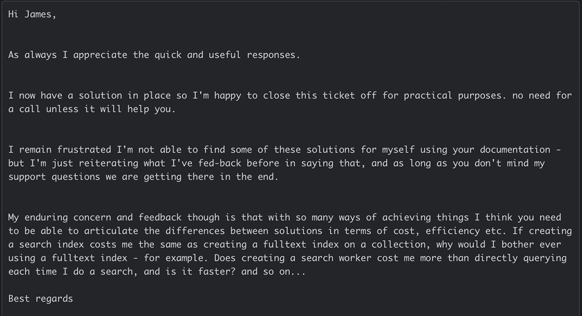
“I remain frustrated I’m not able to find some of these solutions for myself using your documentation.”
Customer, choosing between search options
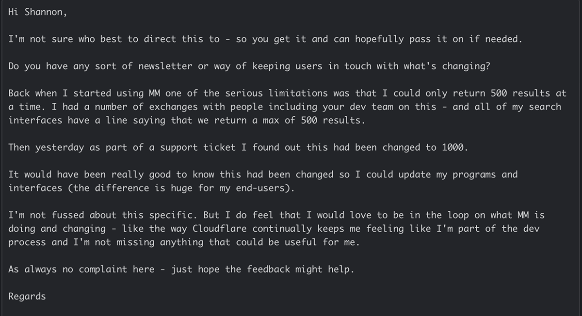
“I would love to be in the loop on what MM is doing and changing.”
Customer, after finding a change through a support ticket
The messages, in fullReal emails from customers to our team. Switch between them with the tabs.
Access: a customer trying to give one person access to one collection
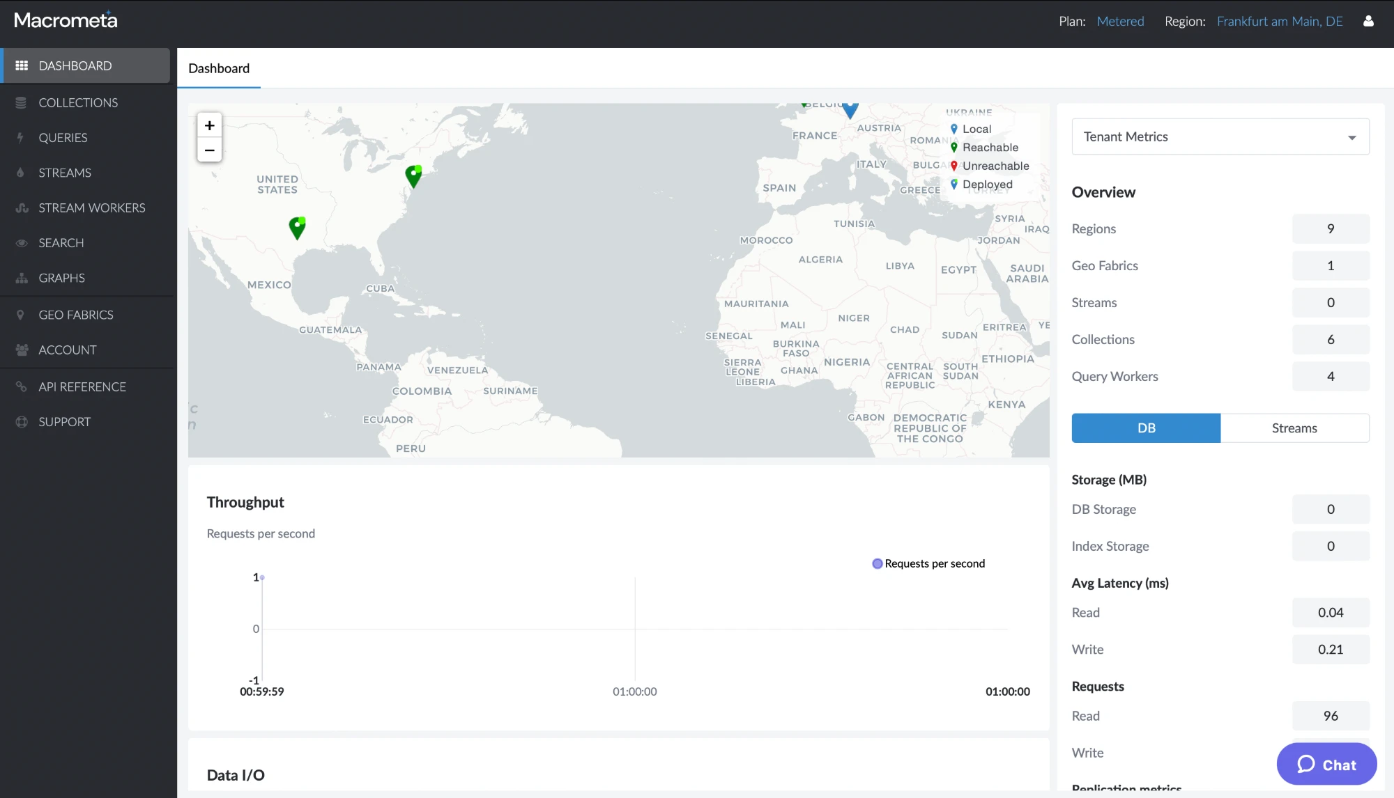
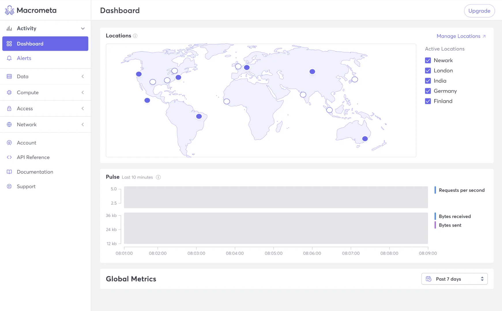
And the first screen after logging in didn’t say what to do next:
The old dashboard: a map, empty charts and terms like “geo fabrics” and “query workers”, with no next step.
What the research showed
Four ways in
I led the research myself:
Support feedback. With the customer success team, I went through what customers had sent to support and documented the common pain points.
A first-time walkthrough. I used the product as a brand-new user to see the gaps for myself.
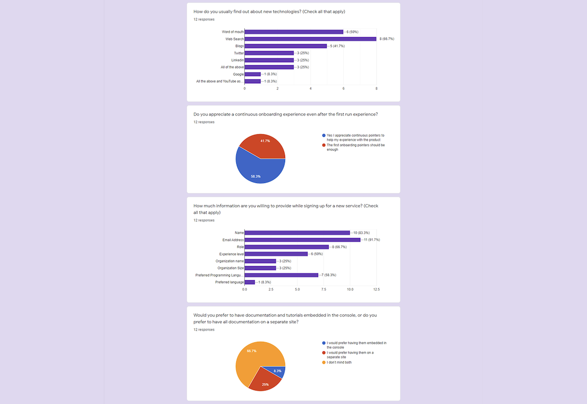
Interviews and a survey with developers, including Macrometa’s own engineers. Developers made up 70% of the company, which made them a useful first group.
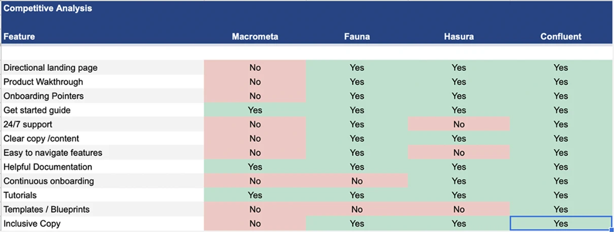
A competitive analysis of onboarding at Fauna, Hasura and Confluent.
Where we stood
Macrometa had a get-started guide, documentation and tutorials. It had no guided landing page, no walkthrough, no onboarding pointers, no templates, and copy that wasn’t clear. Each competitor had most of these.
My competitive analysis of onboarding. Every red cell in Macrometa’s column became something to design.
What developers told us
Hover a decision to see it in the designTap a decision to see it in the design
My survey of 12 developers.
Three insights
Insight 1
No real first experience
There was no onboarding flow, so a new user’s first visit didn’t lead anywhere productive.
Insight 2
Nothing for every level
No tutorials, templates or guides that worked for developers of all experience levels.
Insight 3
An inconsistent interface
The product lacked visual consistency, and there was plenty of room to improve the experience.
Who it was for
Tom, junior software engineer at a new startup
“I am just starting out my software development career. I need a tool that provides as much support as possible.”
Alex, engineering manager at a mid-sized company
“I am constantly looking for the best developer tooling solutions to help my team produce quality work in minimal time.”
Show the way
The product didn’t need more features. It needed to show developers what it could do, and give them something to start from.
A clearer, consistent interface, and a guided start, so no developer has to figure it out alone.
Four principles followed from that:
Find your way
Group the product the way people think about their work.
One calm system
The same patterns on every screen, from the simplest to the most technical.
Show the way
Every first visit ends with a clear next step.
Start from something
Templates, samples and tutorials instead of a blank page.
Part 1 · A clearer product
With our Head of Design, I redesigned the whole platform’s interface. It was the bigger share of the project, and everything in Part 2 is built on it.
1. A layout that groups the work
PrincipleFind your way
The sidebar went from one flat list to a few groups, and the dashboard became something you can read at a glance.
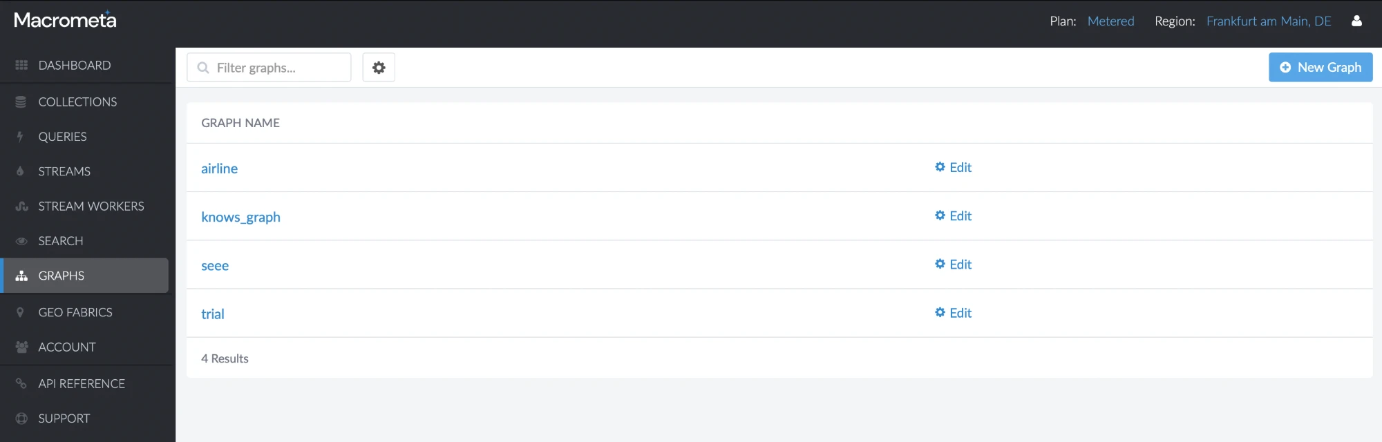
Before
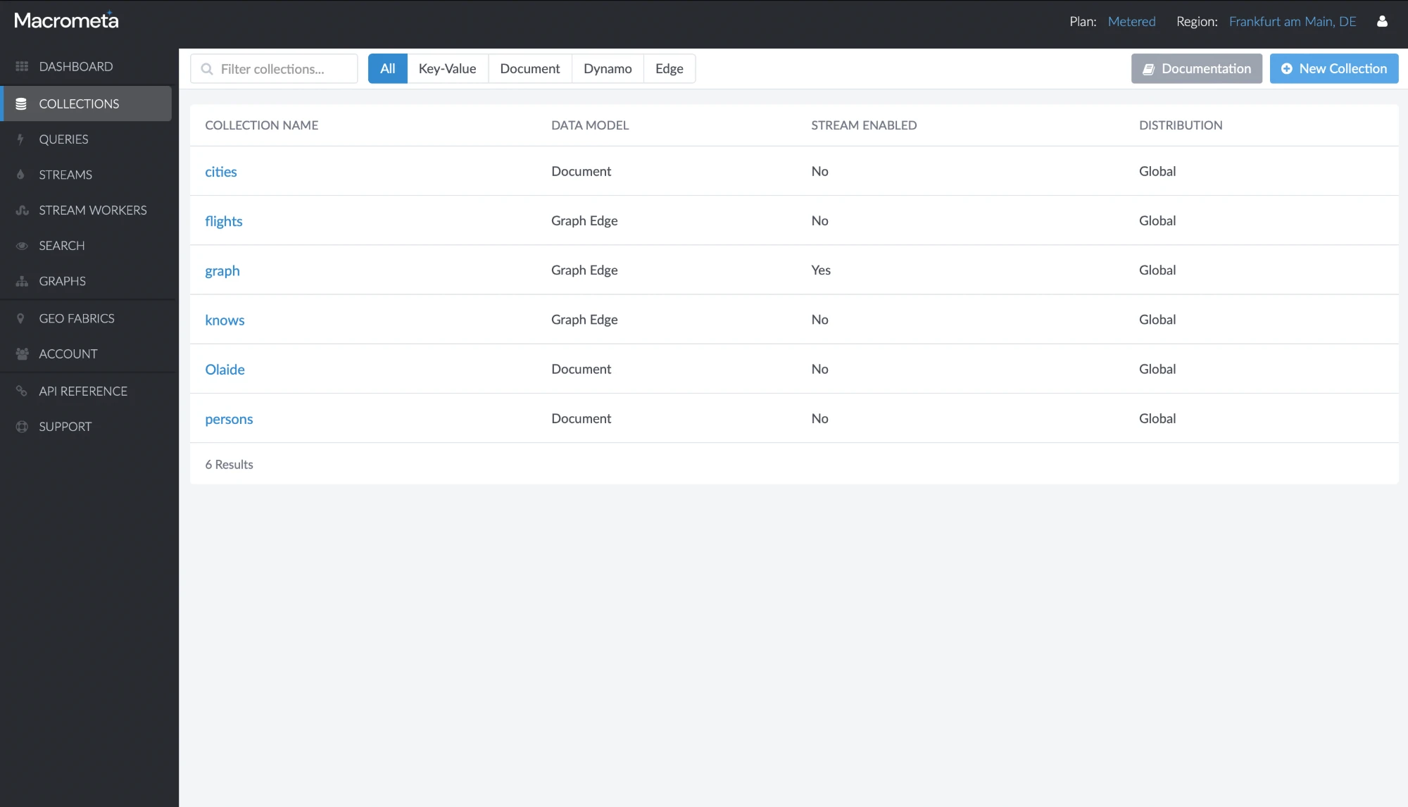
Eleven all-caps links in one flat list, in a dark, dense interface.
The old product.
Now
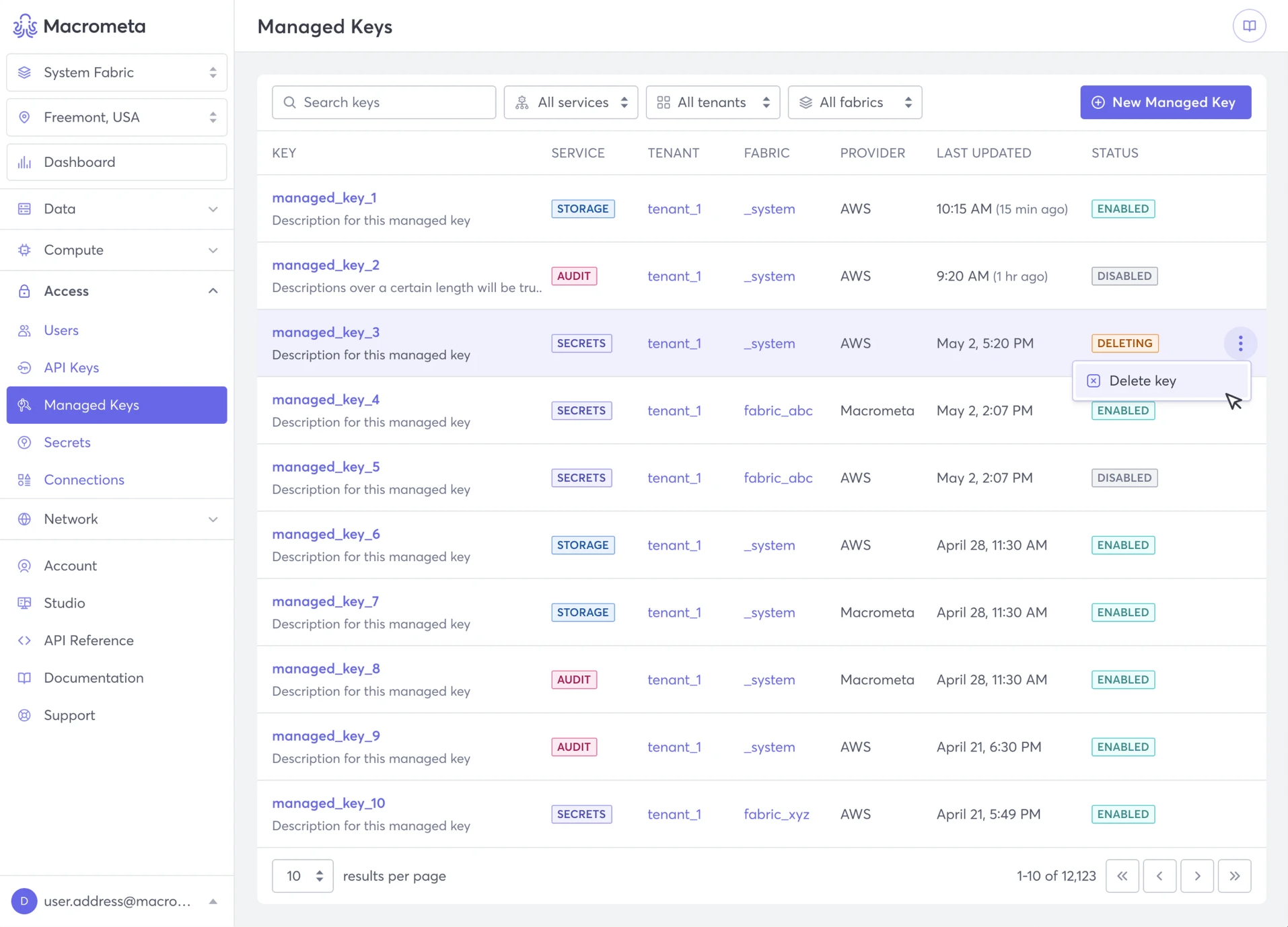
A few groups that open when you need them, with the fabric and region you’re working in at the top.
1The new dashboard
Hover a decision to see it in the designTap a decision to see it in the design
2. One system, every screen
PrincipleOne calm system
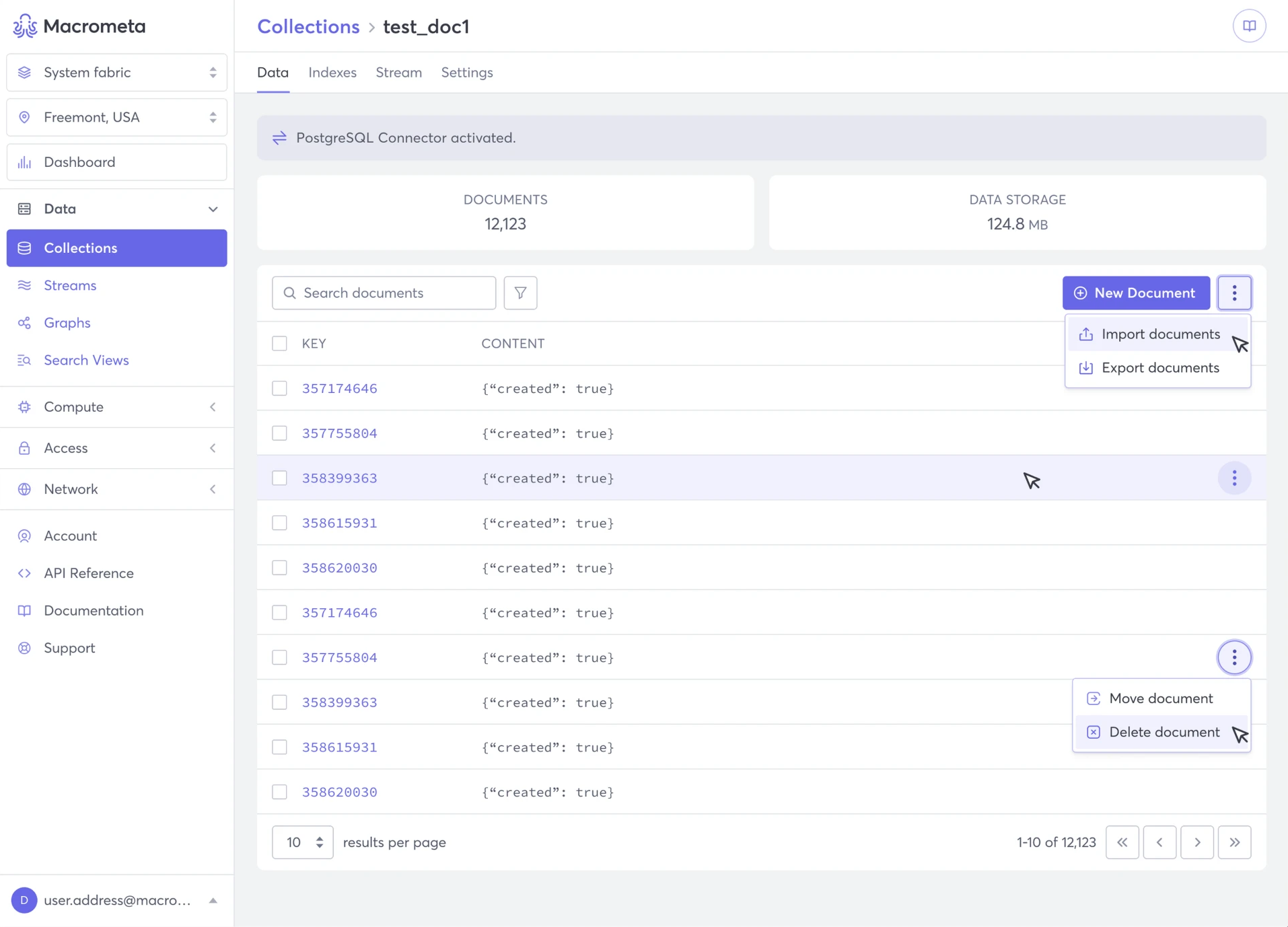
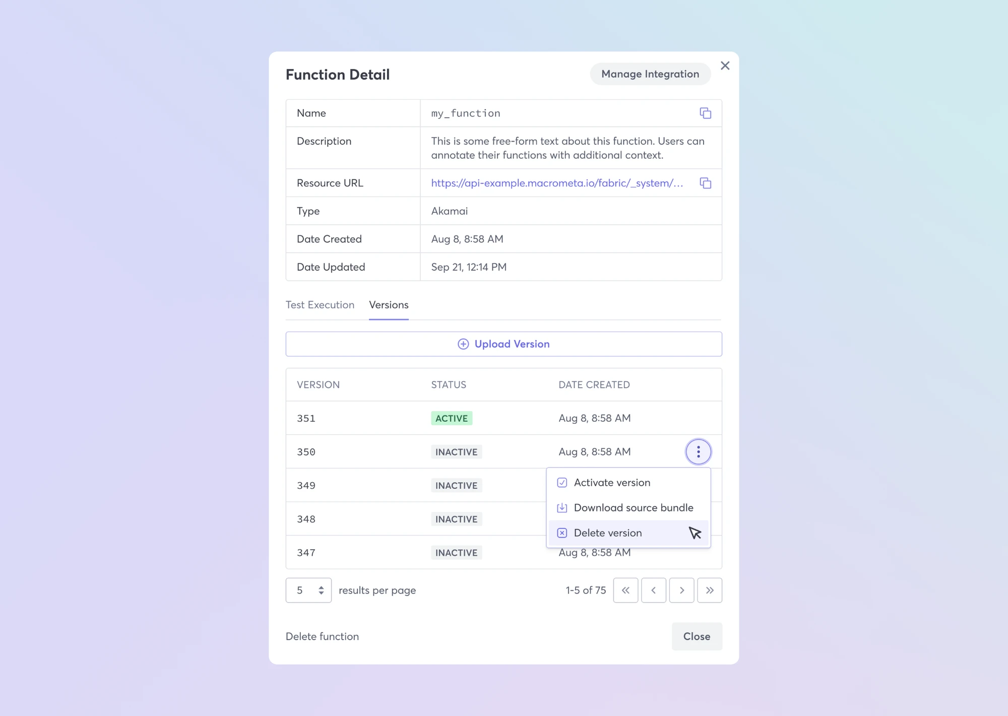
The same patterns run from the simplest list to the most technical tools: clear headings, plain labels, and actions where you expect them.
Before
Plain tables with small type, and each area looking a little different.
The old product.
Now
Breadcrumbs, tabs, badges and menus that work the same way everywhere.
1The system at workClick a tab to see each screen and the decisions behind it
Hover a decision to see it in the designTap a decision to see it in the design
Hover a decision to see it in the designTap a decision to see it in the design
Hover a decision to see it in the designTap a decision to see it in the design
Hover a decision to see it in the designTap a decision to see it in the design
Your data: a collection, its numbers and its actions
Part 2 · A guided start
I led onboarding and activation: how developers arrive, what they see first, and how they get to something working.
3. A clear way in
PrincipleShow the way
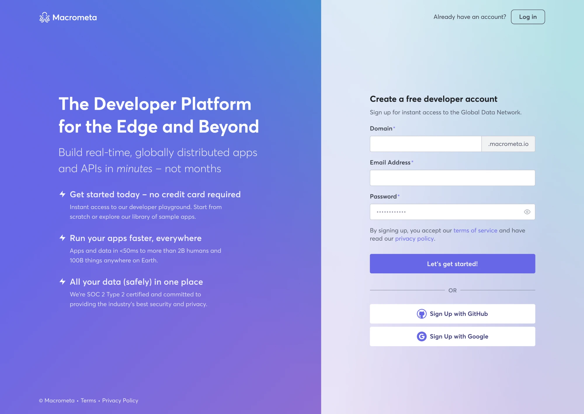
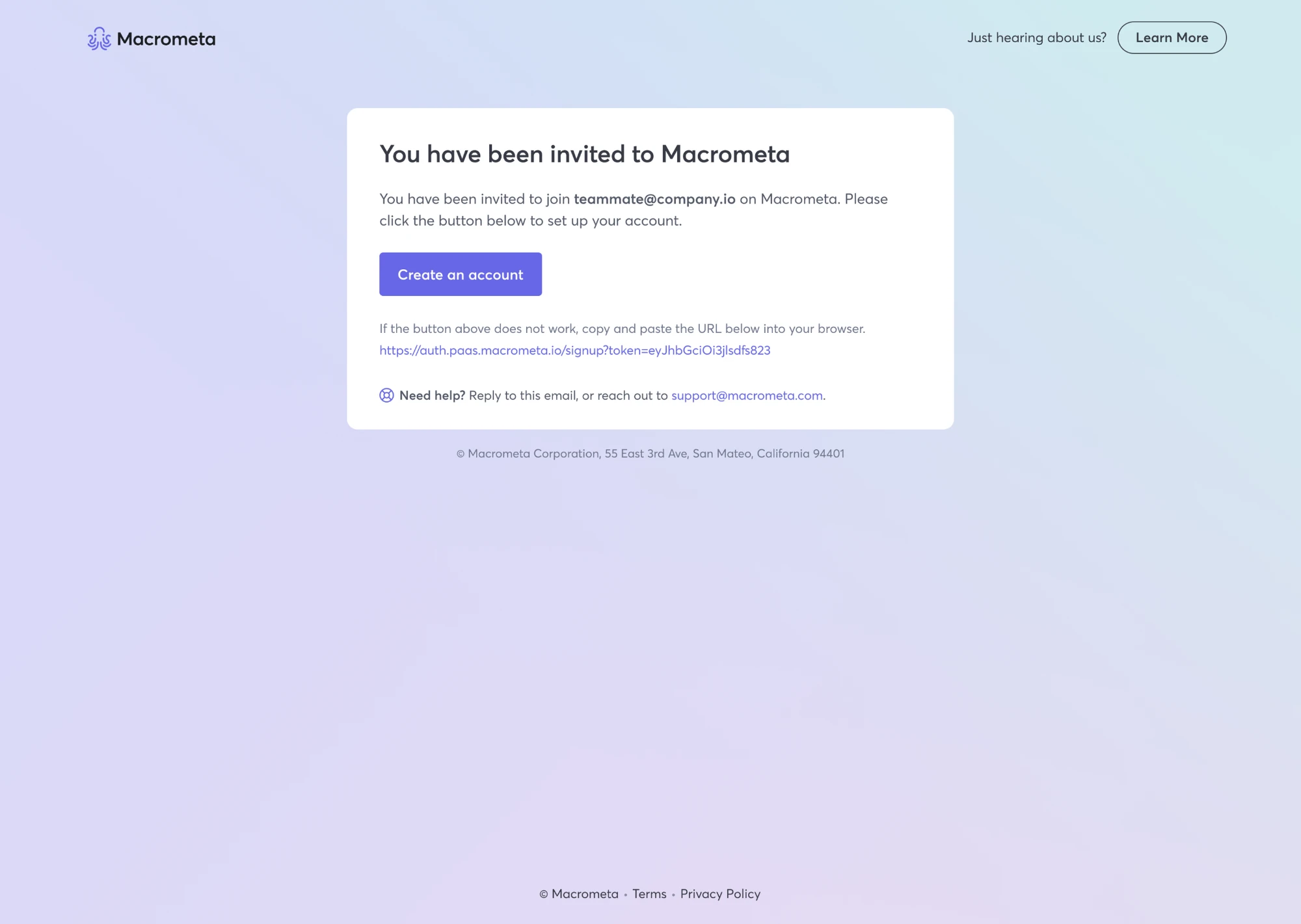
Sign-up became the first place the product explains itself, for people who arrive on their own and for teammates who are invited.
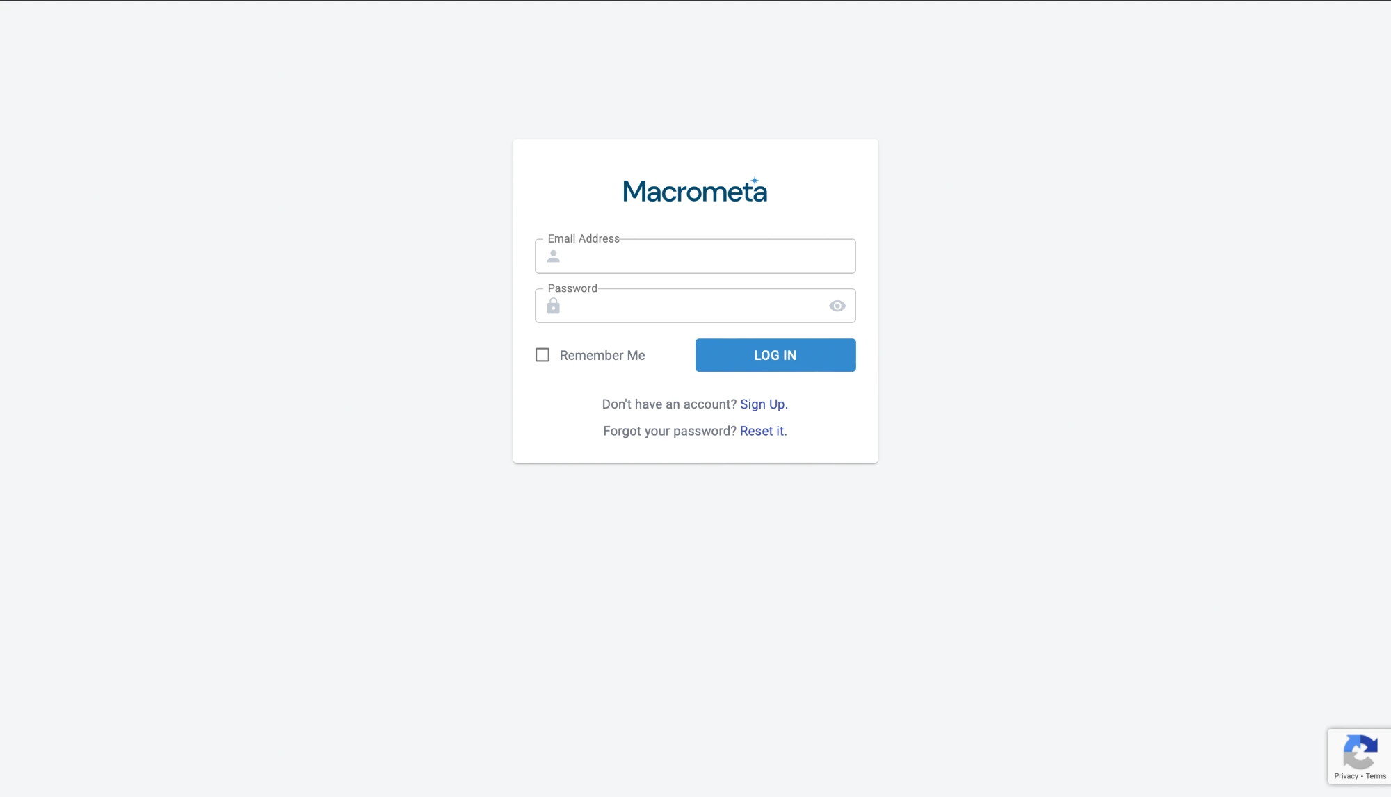
Before
A small login card, with sign-up as a link underneath.
The old product.
Now
A free account that leads with what you can build, asks for little, and lets you sign up with GitHub or Google.
1Getting inClick a tab to see each way in, and the decisions behind it
Hover a decision to see it in the designTap a decision to see it in the design
Hover a decision to see it in the designTap a decision to see it in the design
Sign up: a free developer account
4. A first visit with a next step
PrincipleShow the way
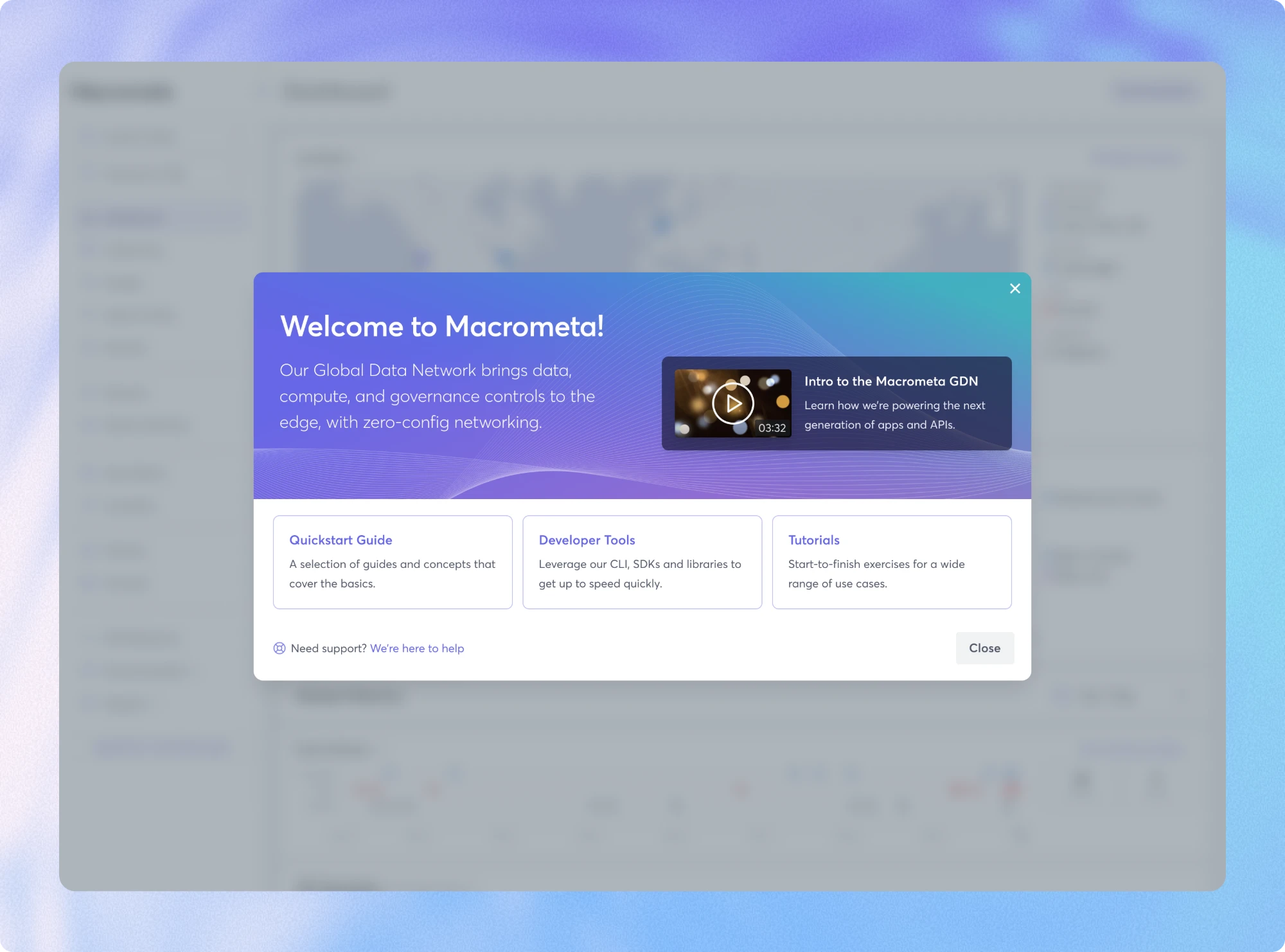
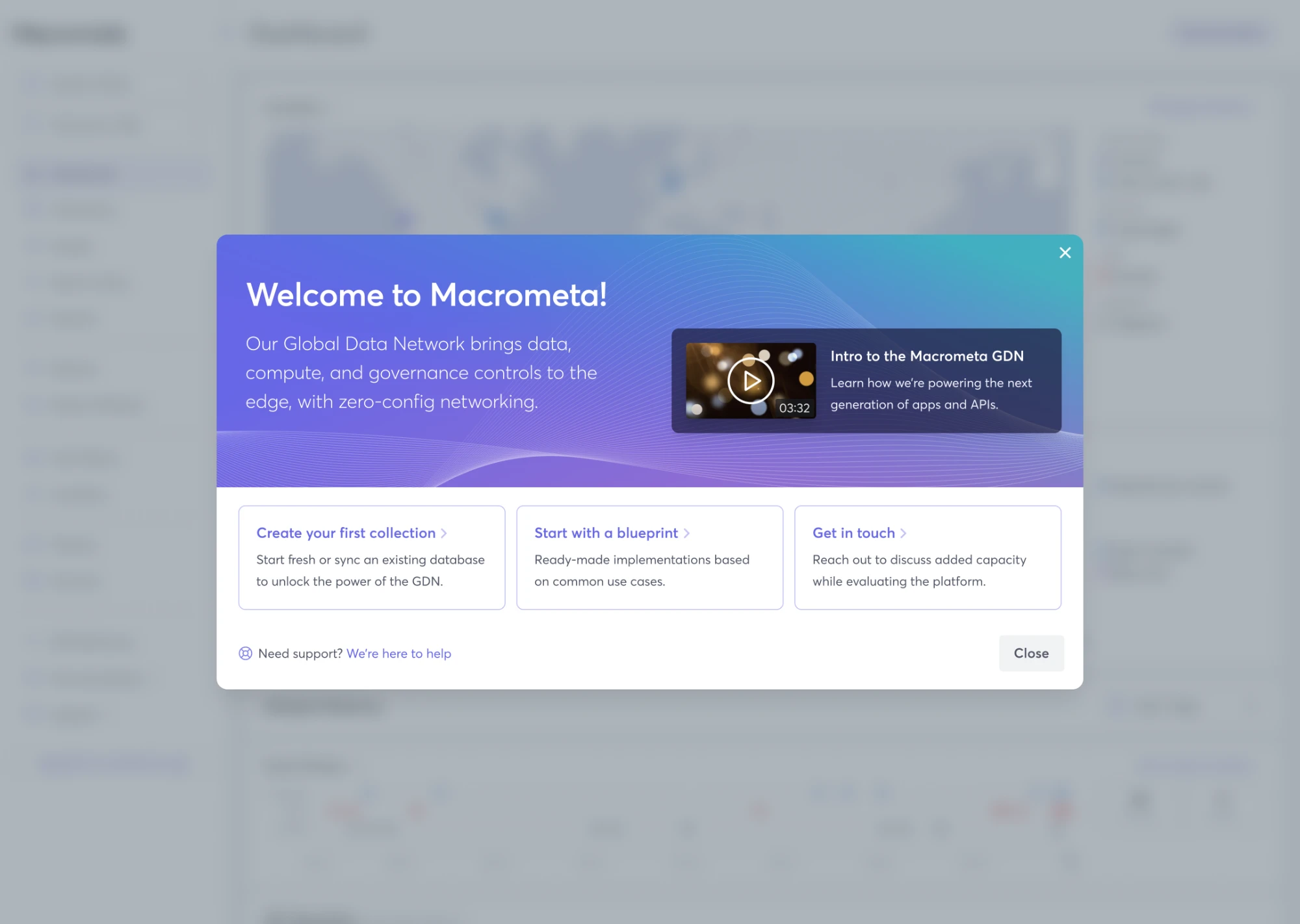
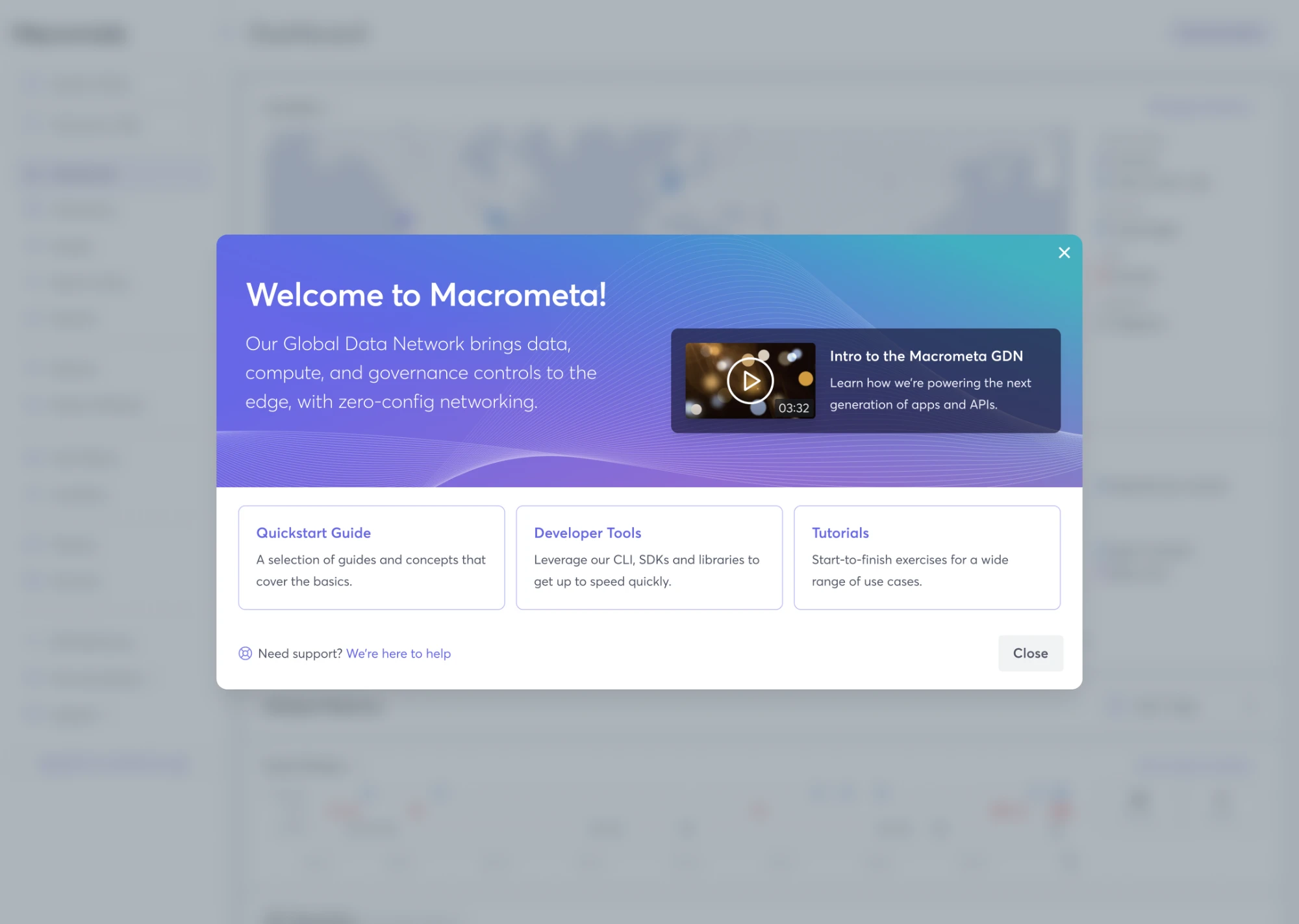
New users now land on a welcome with a short intro, a video, and three places to start. A survey answer asked for “a brief video of key capabilities”, and the welcome has one. We went through two iterations, each testing the quickest way to a developer’s first win. The first offered three paths: build a collection, start from a blueprint, or talk to us. The second, which we landed on, points to a quickstart guide, developer tools and tutorials.
Before
Straight into a dashboard of maps and metrics, with nothing to do.
Now
A welcome that explains the platform in one line and offers three clear ways to begin.
1The welcome, in two iterationsClick a tab to compare the first and second iteration
Hover a decision to see it in the designTap a decision to see it in the design
Hover a decision to see it in the designTap a decision to see it in the design
First iteration: build, use a blueprint, or talk to us
5. Never a blank page
PrincipleStart from something
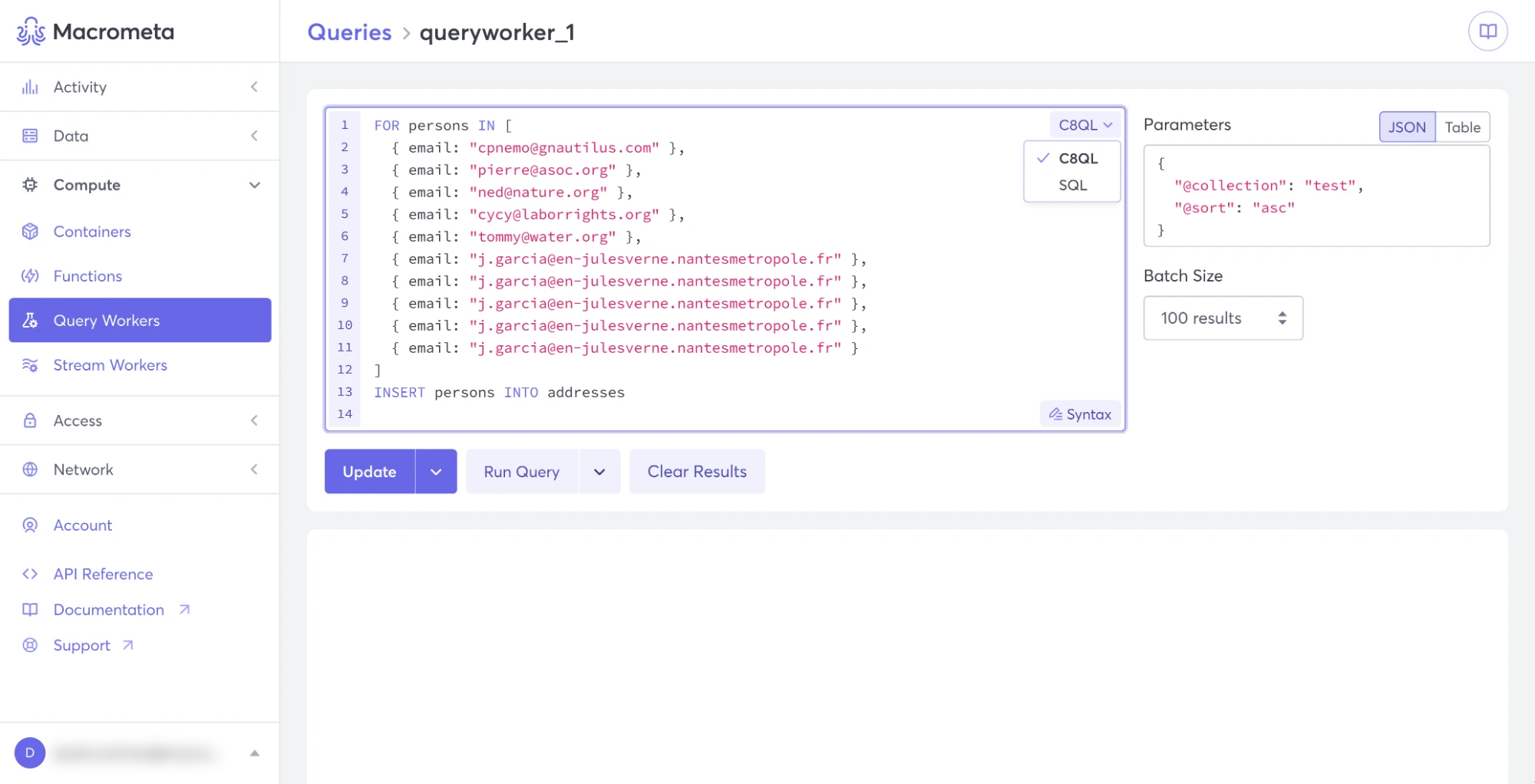
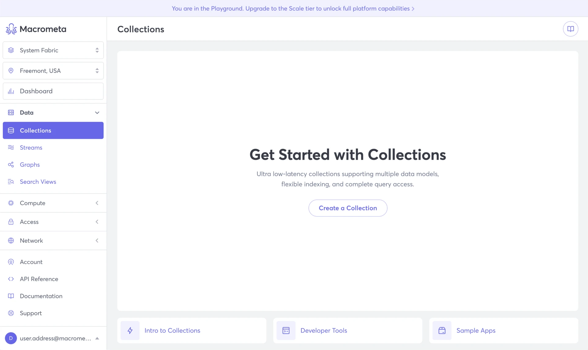
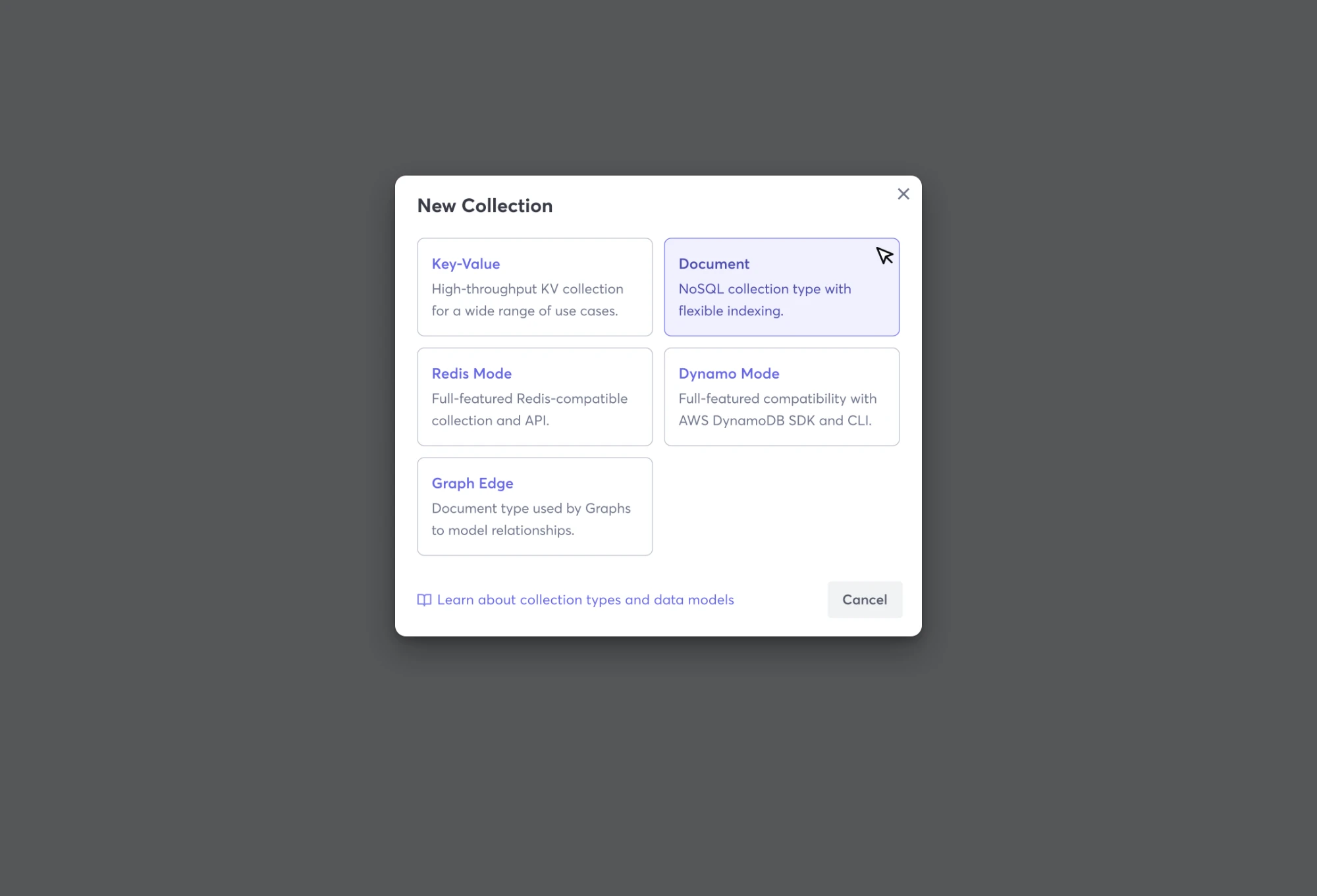
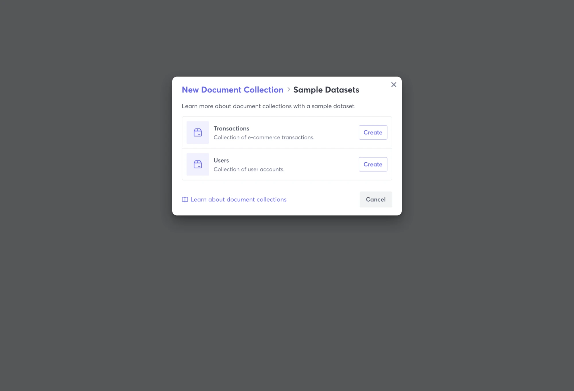
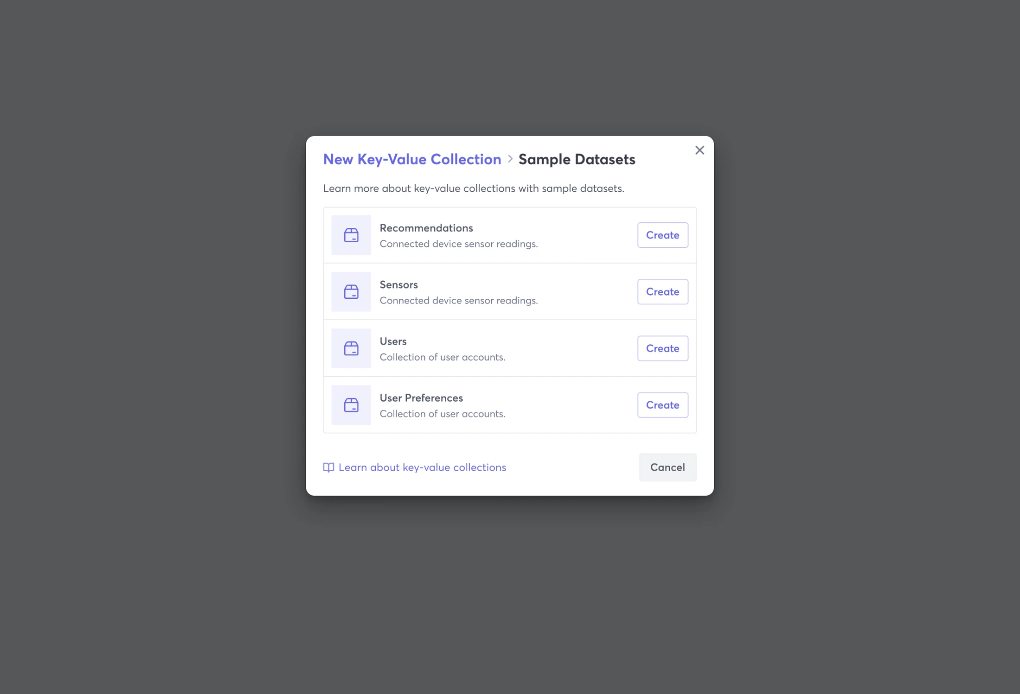
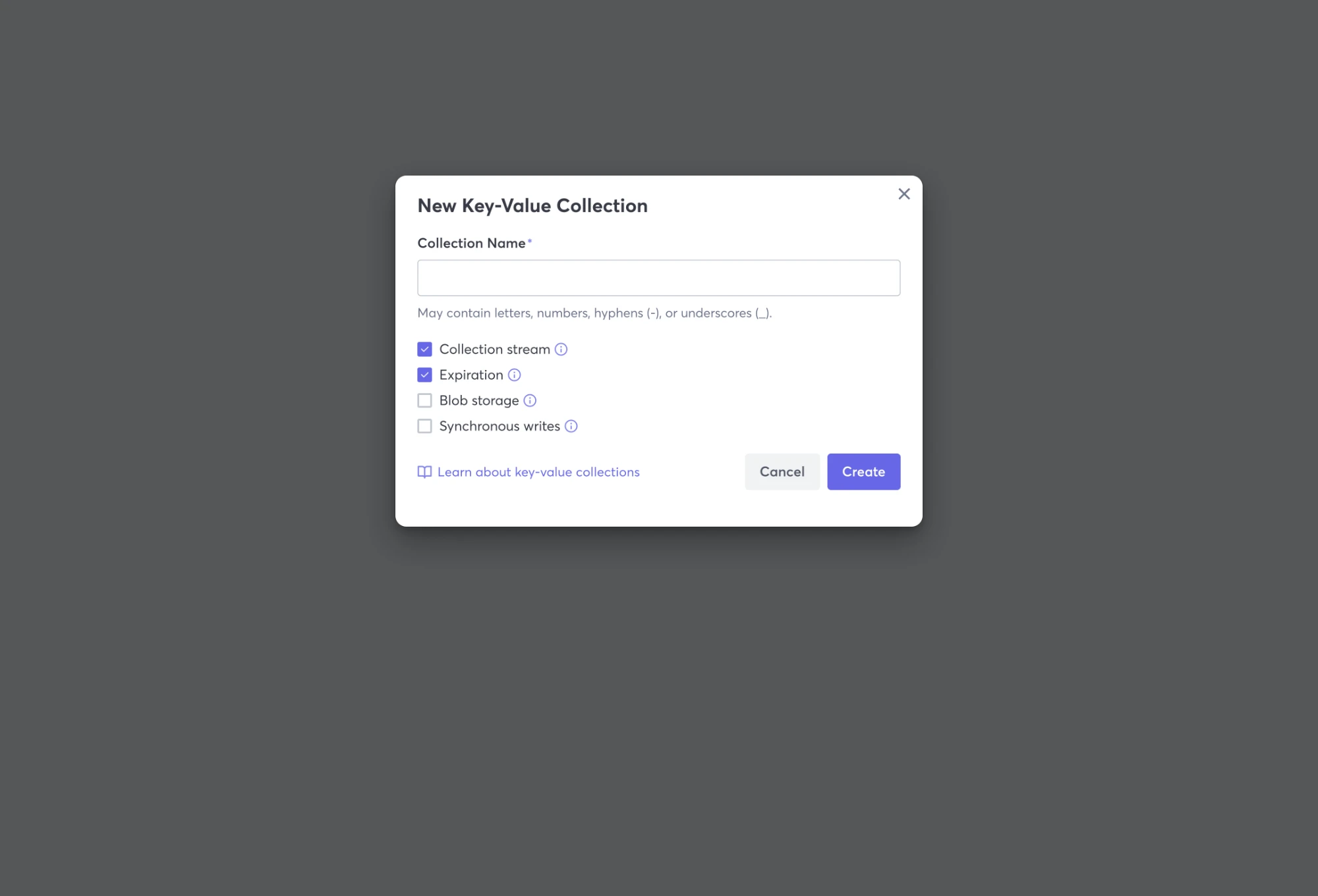
Creating a collection became a guided path: an empty state that teaches, plain-language choices, and sample datasets to start from. 85% of users adopted templates, because one click added a working sample to whatever they were creating.
Before
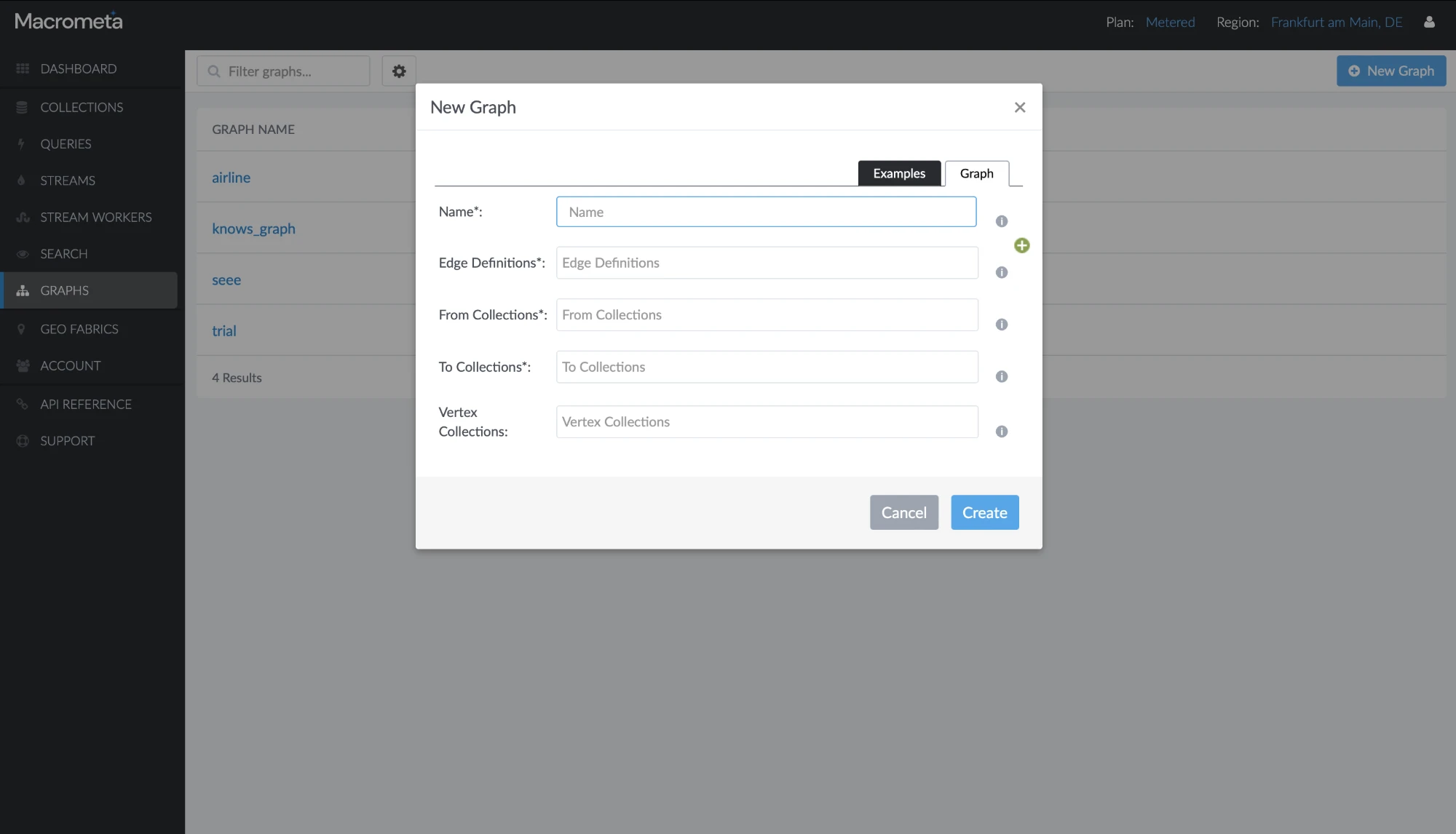
A form of required fields in database terms, with only small info icons for help.
The old product.
Now
Choose a type in plain words, start from a sample dataset in one click, and find the docs right where the question comes up.
1Creating a collectionClick a tab to follow the flow, and see the decisions behind each step
Hover a decision to see it in the designTap a decision to see it in the design
Hover a decision to see it in the designTap a decision to see it in the design
Hover a decision to see it in the designTap a decision to see it in the design
Hover a decision to see it in the designTap a decision to see it in the design
Hover a decision to see it in the designTap a decision to see it in the design
Empty state: what you see before your first collection
Developers who stay
I tested key interactions with 15 developers across experience levels before launch. After six months of use, product analytics and the customer success team showed the change:
Retention
+54%
customer retention
After 6 months
Support
−55%
support tickets
From customer success
Onboarding
73%
faster sign-up completion
Product analytics
Templates
85%
adoption of templates
Product analytics
How we measured: product analytics and customer success, after six months of use.
User satisfaction rose 50%, and sales leads rose 57%. Macrometa made $2M in revenue that year, and better onboarding was part of that story: marketing promoted the new flow to bring people in.
What this project shows about how I work
I start where people get stuck.
Support feedback, and using the product as a brand-new user, showed exactly where developers dropped off.