Employees kept speaking up, and nothing changed. I designed Fount, which turns every answer into a map of the employee journey, and a year later Fount AI, which tells HR what to fix first. Weekly participation averaged 81%, and Fount earned $3M+ in its first year.
Role
Senior product designerThe only designer. I led both products end to end.
Team
Head of Product, product team and engineersAcross both products
Timeline
5 months, then 3 monthsFount AI came about a year after Fount launched
Status
Shipped
Click any image to see it full size.
At a glance
The problem
Employees gave feedback and never saw it change anything. Managers and HR had the data, but no clear way to turn it into decisions leadership would back.
What I found
The same four causes came up in every organisation: a trust gap, feedback fatigue, problems seen too late, and data that never became decisions.
The ideaTurning point
Turn feedback into a map of the employee journey, so anyone can see which moments matter most, and why.
What shipped
Fount: quick pulse surveys, and a journey dashboard that shows which moments to fix first, and why. A year later, Fount AI: a conversation that finds the main problems in employee comments, suggests fixes with their sources, and ranks them by return.
Results
81%
weekly participation in micro-surveys
63%
of friction points with an action plan within 30 days
6.2 → 1.4 wks
from issue to resolution with Fount AI
$3M+
revenue in year one
Feedback that went nowhere
Companies collected feedback. Little of it turned into change.
One of our customers had seen average employee turnover rise 28% in two years, and 65% of their exit interviews named “unaddressed workplace frustrations” as a reason for leaving. The feedback was there. It just never led anywhere.
The problem looked different depending on who you asked:
“I feel like my voice isn’t really heard, as I don’t see any changes in my department, even though I’ve given feedback and suggestions several times.”
Software Engineer, mid-sized company
“My team is struggling, and I don’t feel like I’m doing my best as a manager. I can’t turn their feedback into action plans, because I don’t know what’s causing the friction.”
Team Lead, customer success
“I’ve spent three months trying to get executive buy-in for our improvement plan, because I can’t show data on its impact.”
HR Leader, manufacturing company
Three people, one broken loop. Employees spoke up, managers couldn’t tell what to fix first, and HR couldn’t prove the value of fixing it. So nothing moved.
What the research showed
Listening across companies, roles and levels
I led the research myself, starting at INGKA and then widening it to other industries:
24 contextual interviews at INGKA across departments and seniority levels. I ran 14 of them.
8 interviews at other organisations in tech, healthcare, finance and manufacturing.
16 sessions with HR and leadership stakeholders, all facilitated by me.
A review of existing survey data and exit interviews, and a competitive analysis of the feedback tools on the market.
Many complaints, four causes
Cause 1
A trust gap
People didn’t believe honest feedback would lead to change, so they stopped giving it.
Cause 2
Feedback fatigue
Long surveys, with nothing visible coming out of them.
Cause 3
Problems seen too late
Managers only found out about issues once they were already critical.
Cause 4
Data, but no decisions
HR had plenty of data but couldn’t turn it into clear priorities.
Underneath it all
Feedback was treated as a survey to run, not a loop to close. Nobody could see what happened after they spoke up.
Three groups needed different things from the same loop. Employees wanted to be heard without extra work. Managers wanted to know what to fix first. HR partners wanted a clear story that drives decisions and proves impact.
One loop to close
Another survey tool wouldn’t fix this. People needed to see feedback the way employees experience work: as a journey of moments, each one good or bad for a reason.
Turn feedback into a map of the employee journey, so anyone can see which moments matter most, and why.
Four principles followed from that:
Quick to give
Giving feedback is quick, not a chore.
See what matters most
Managers see priorities, not raw data.
Know why, not just what
Every score breaks down into the people and things behind it.
Impact you can prove
Benchmarks and trends show leadership what changed.
Choosing what to build first
With Fount’s decision makers, I ran a prioritisation vote on what was most feasible, most valuable and most likely to bring in revenue at our stage. Then I ran an ideation workshop with stakeholders on the journey and flow for each group. Eight features made the first plan, and four waited for later, including an AI agent. Within that plan, version one shipped the core: quick pulse surveys, and a journey view that turns the answers into priorities.
Planned first
Survey creation
Pulse surveys
Data and insights dashboard
Feedback analysis
Solution recommendations
ROI calculator
Roles and permissions
Integrations
Shipped in version one. We shipped these first, and planned the rest to follow.
Later
AI agent
Action tracker
Feedback portal
Performance management
The AI agent came next. A year later, it became Fount AI.
The outcome of the prioritisation vote: what we planned first, and what waited
Act 1 · Fount: from feedback to a map of the journey
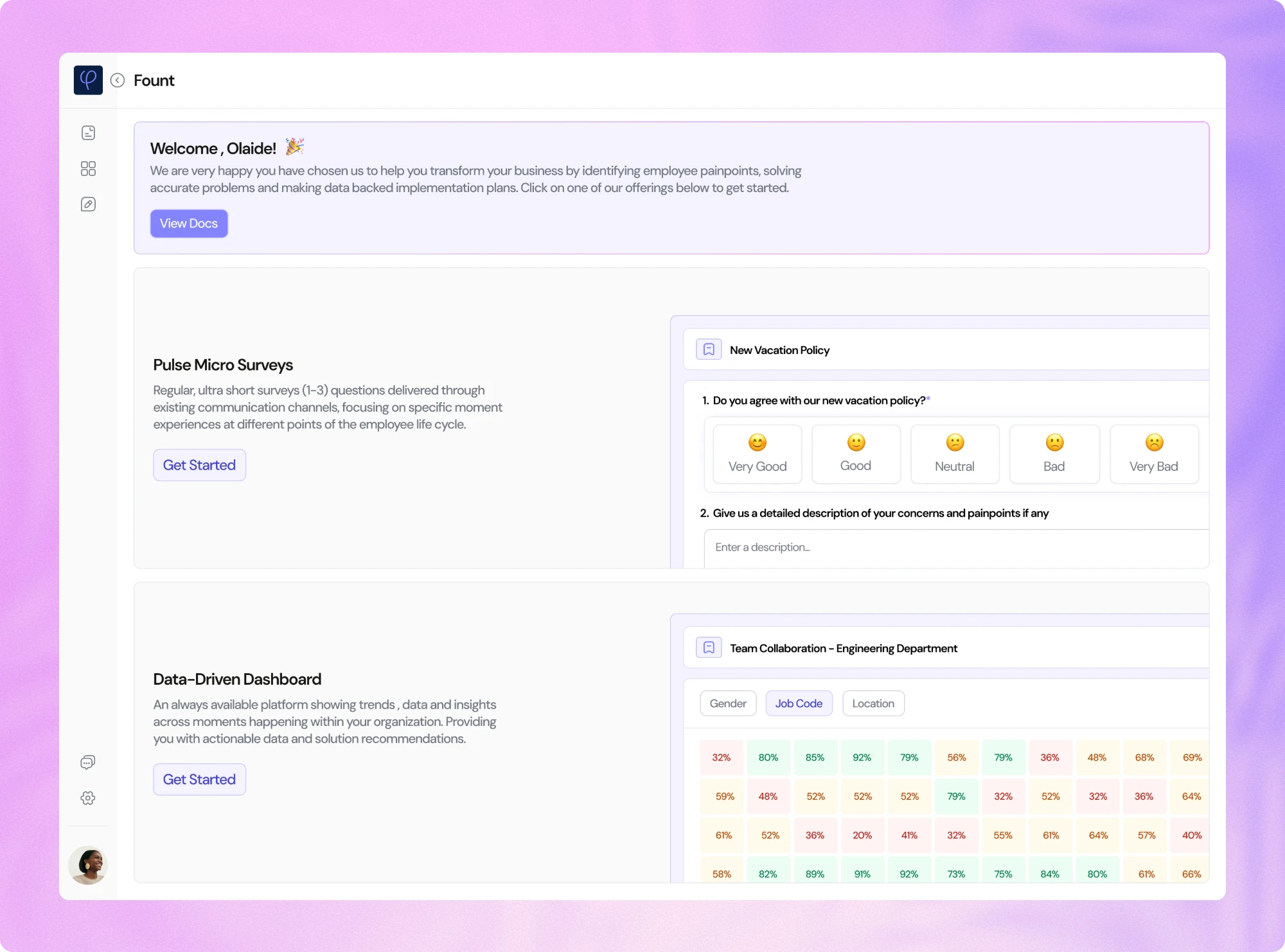
Fount had two halves that worked as one loop. Managers and HR send short pulse surveys at the moments that matter, and every answer lands on a map of the employee journey, so anyone can see which moments are working, which aren’t, and why.
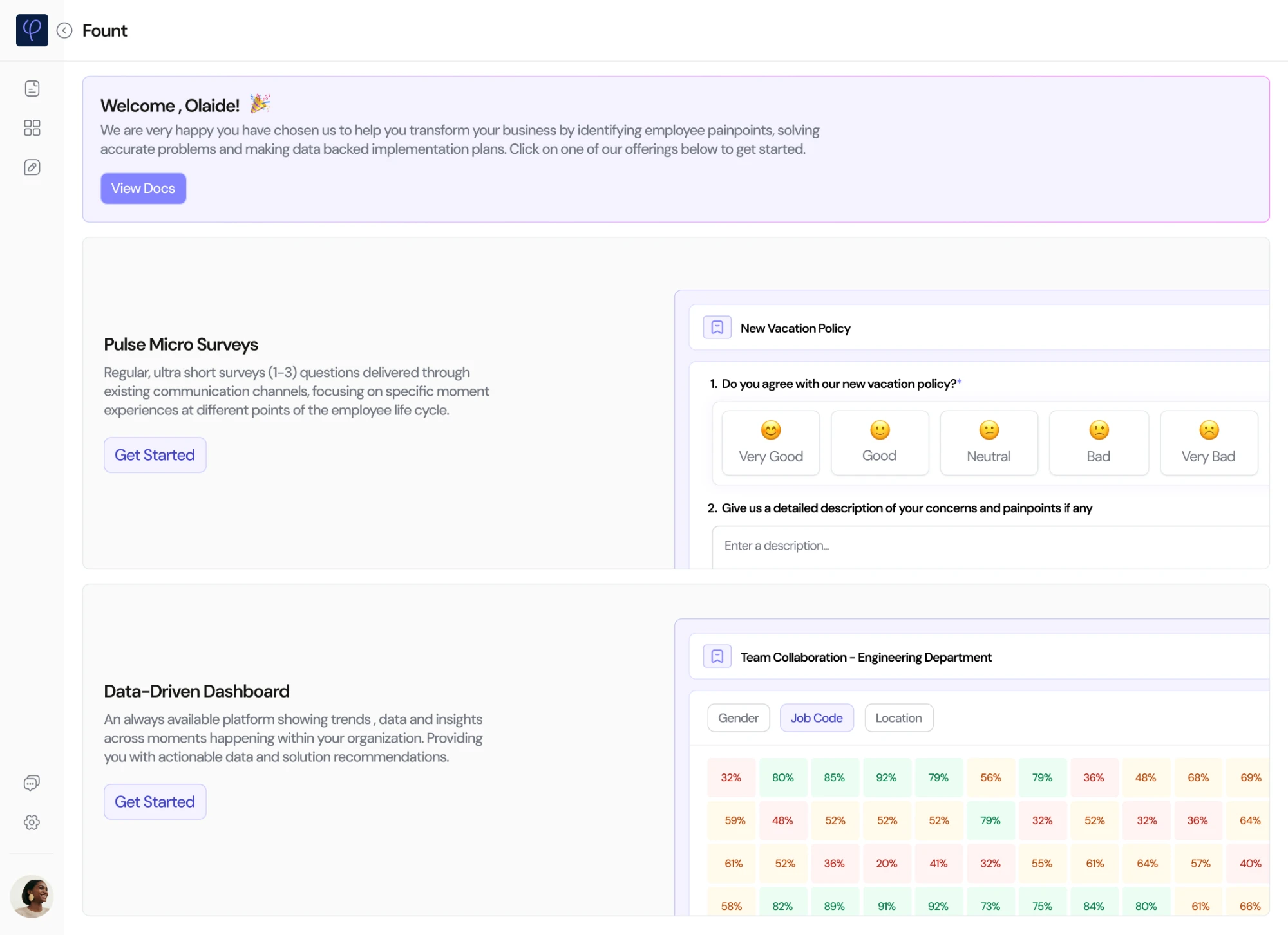
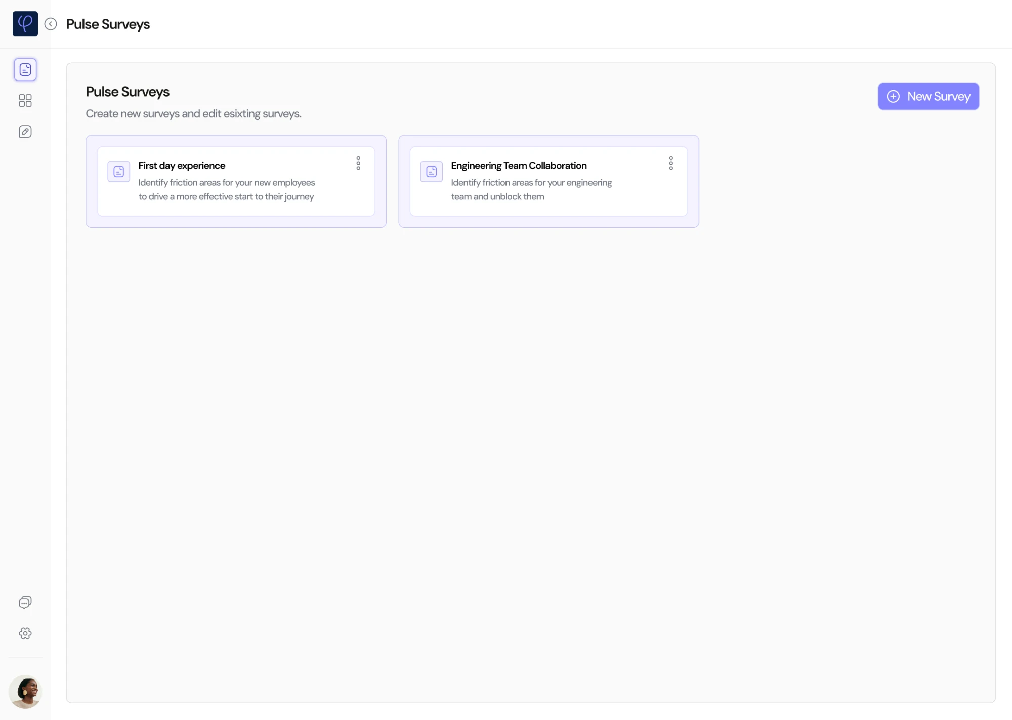
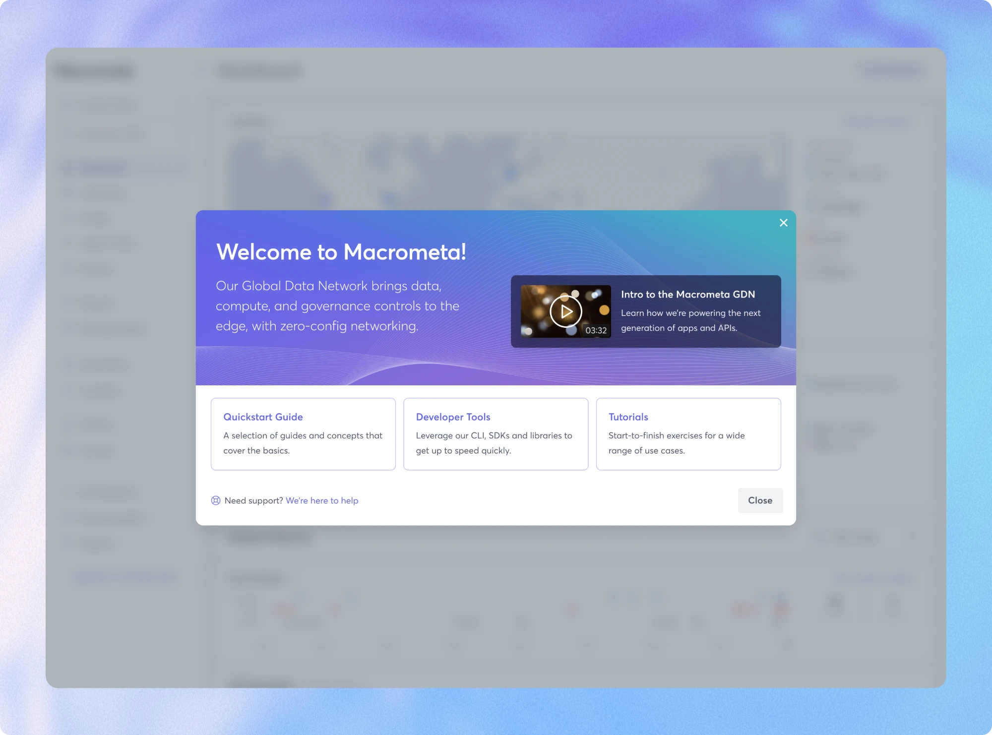
Every new user lands on the same welcome screen. It shows both halves side by side, each with a preview of the real thing, so people know what they’re getting before they click.
Hover a decision to see it in the designTap a decision to see it in the design
The welcome screen: where every new user starts
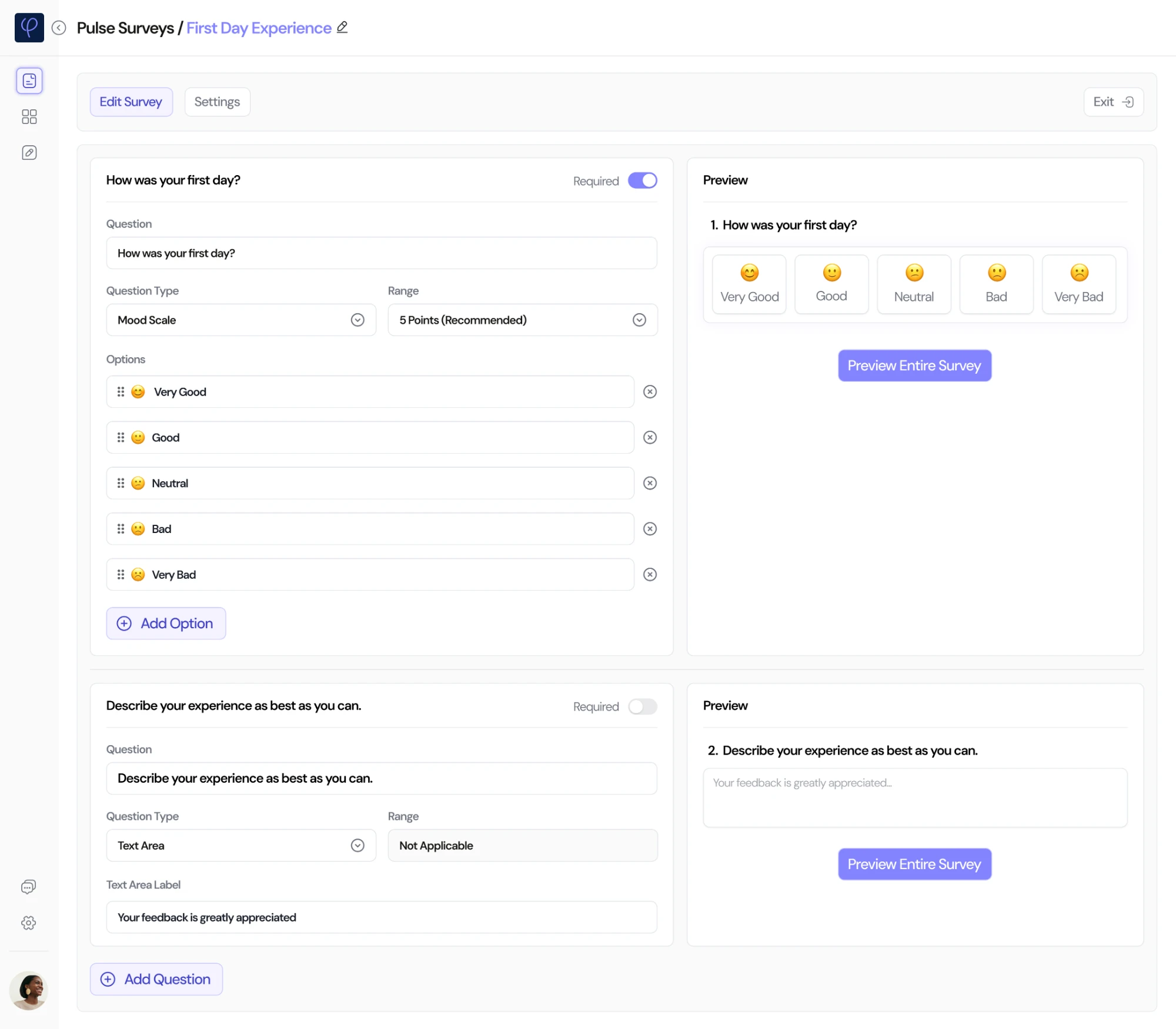
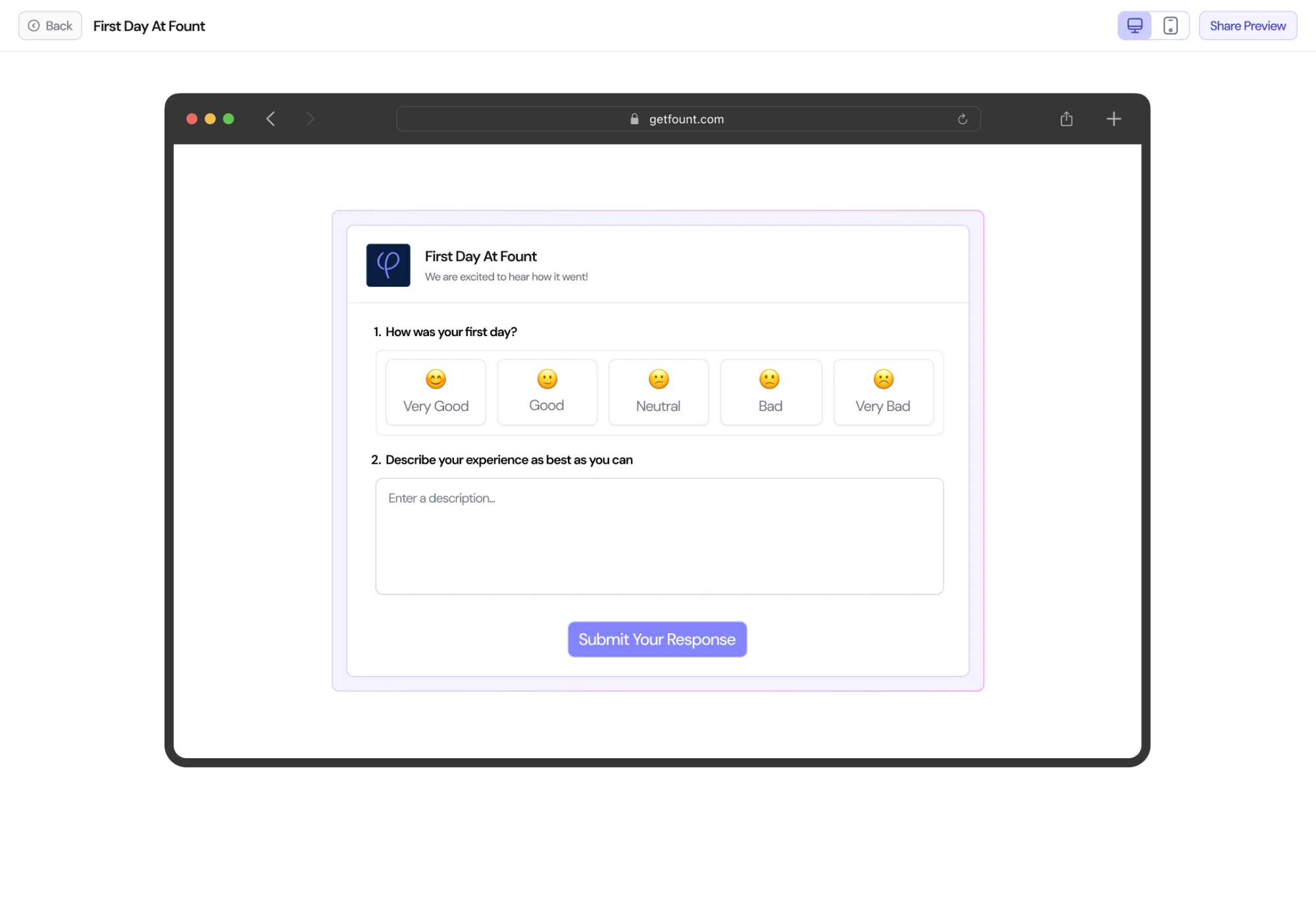
1. Pulse surveys in minutes
PrincipleQuick to give
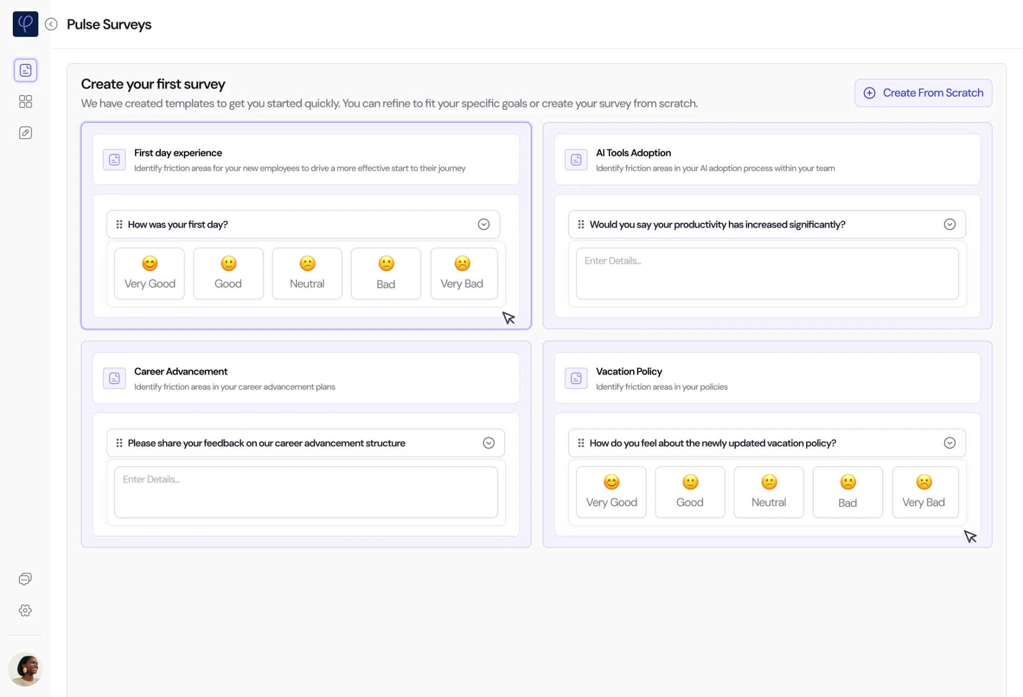
Get Started on surveys opens straight into templates, so the product starts with the thing that brings in data.
Before
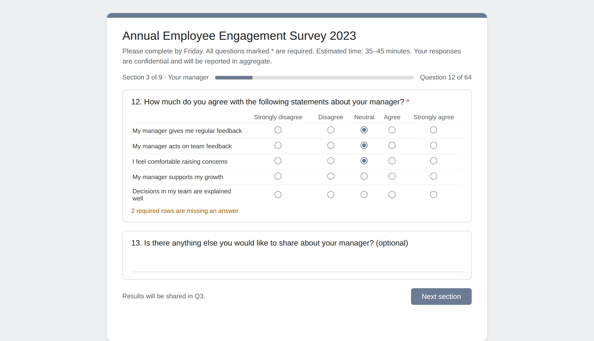
One long annual survey, with results promised months later.
An illustration of the old way, recreated for this case study.
Now
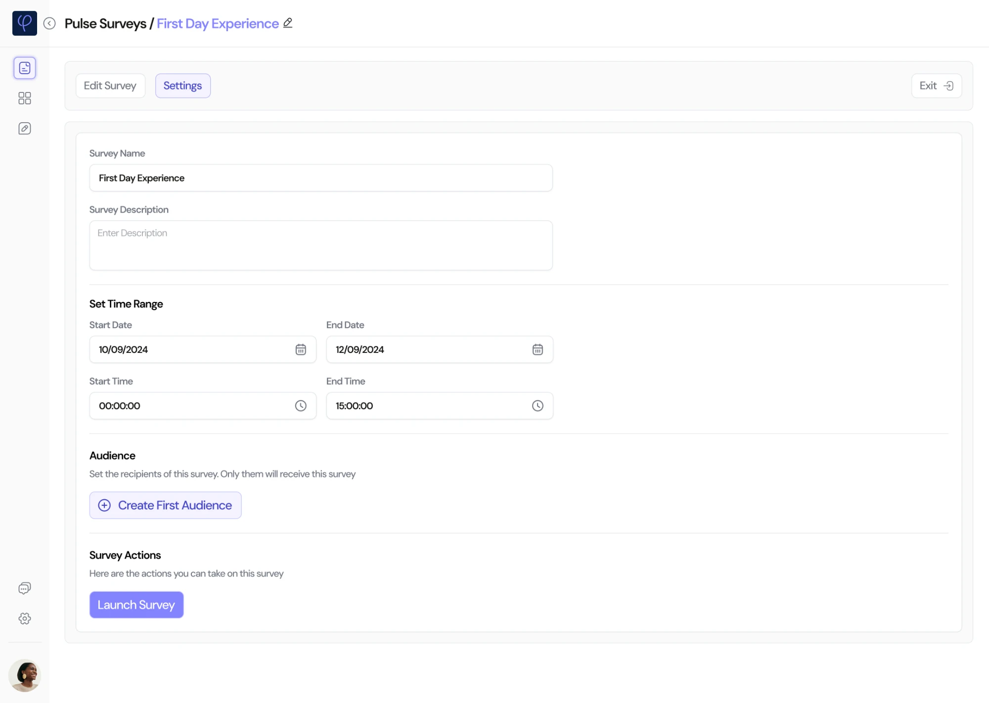
Short surveys built from templates, sent to the right people for a set time, and quick to answer on any device.
1Creating a surveyClick a tab to follow the flow, and see the decisions behind each step
Hover a decision to see it in the designTap a decision to see it in the design
Hover a decision to see it in the designTap a decision to see it in the design
Hover a decision to see it in the designTap a decision to see it in the design
Hover a decision to see it in the designTap a decision to see it in the design
Start from a template: Where Get Started leads
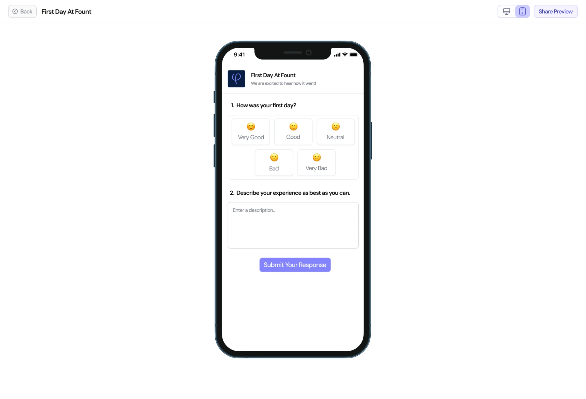
2What employees seeCheck the same survey on a phone and on a desktop
Hover a decision to see it in the designTap a decision to see it in the design
Hover a decision to see it in the designTap a decision to see it in the design
On a phone: The survey as employees see it on mobile
2. The whole journey, at a glance
PrincipleSee what matters most
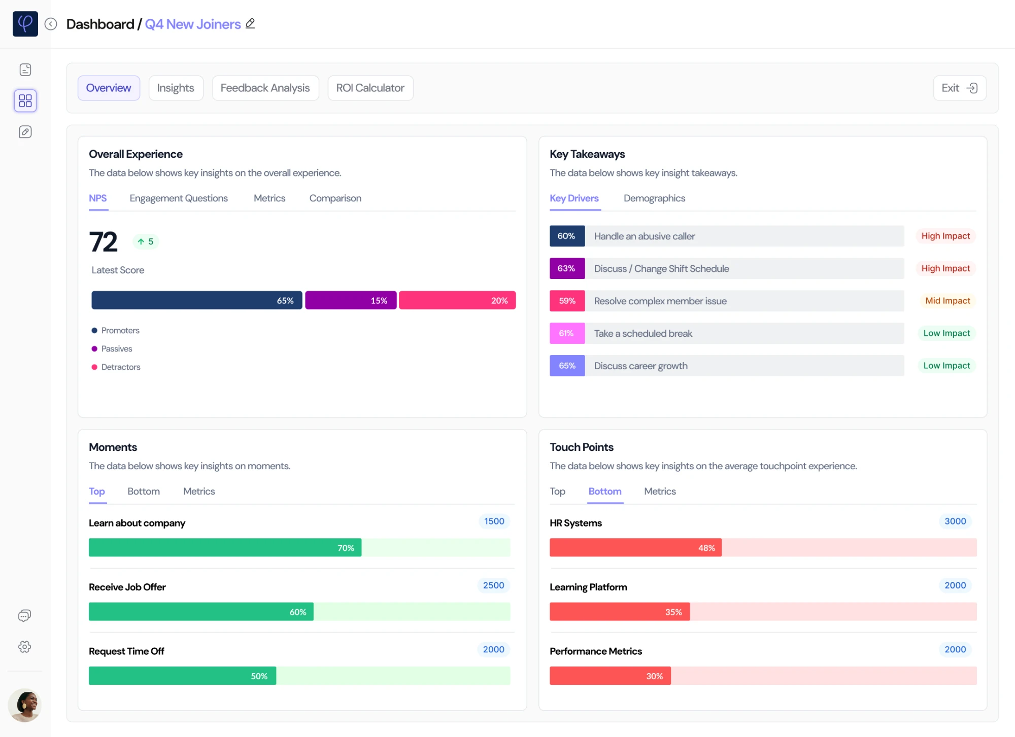
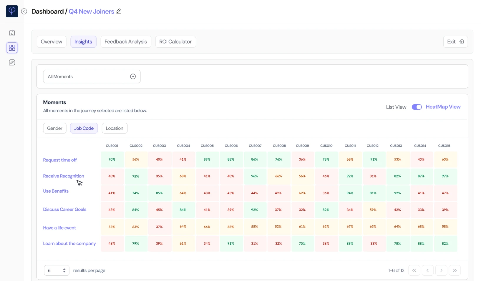
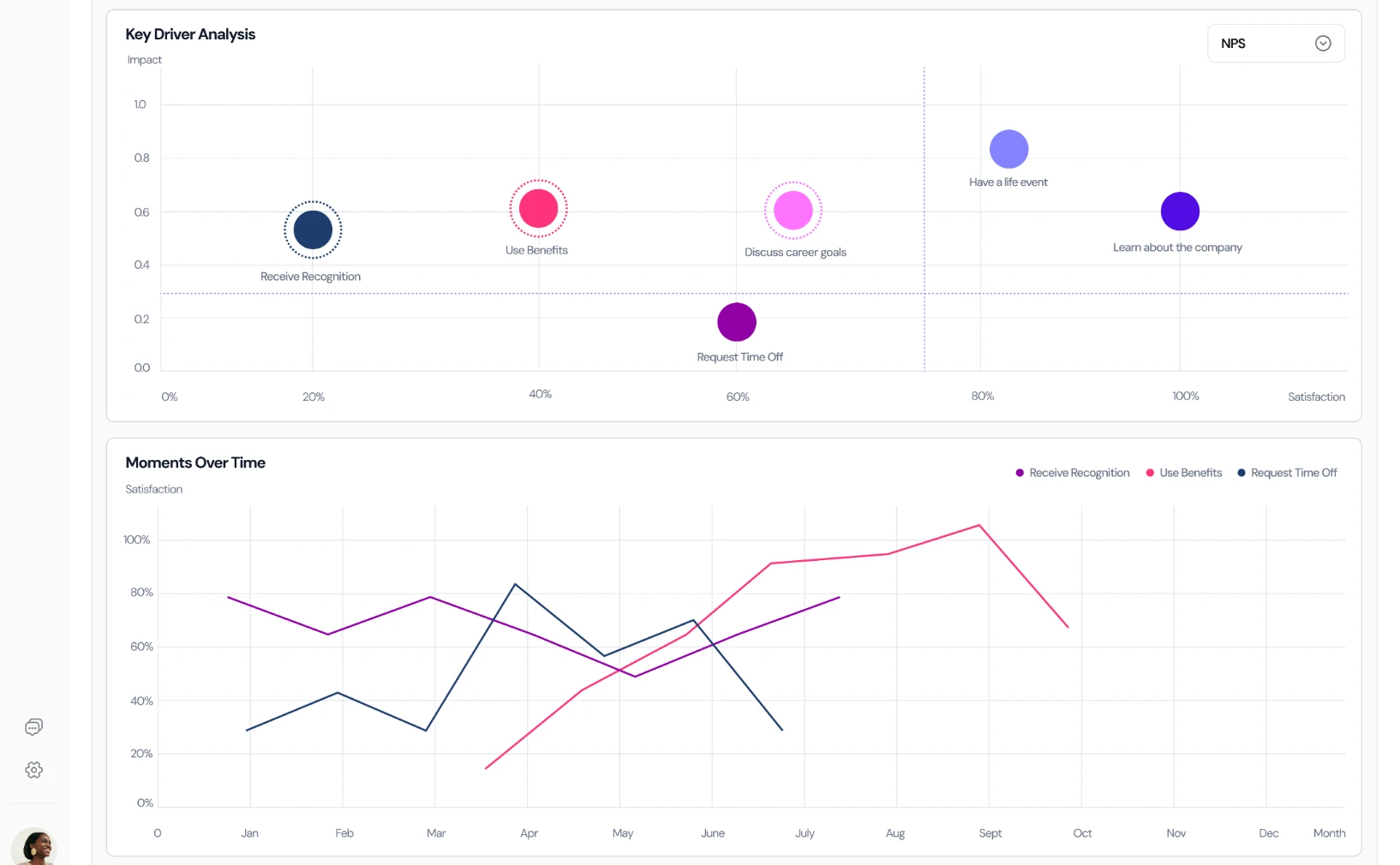
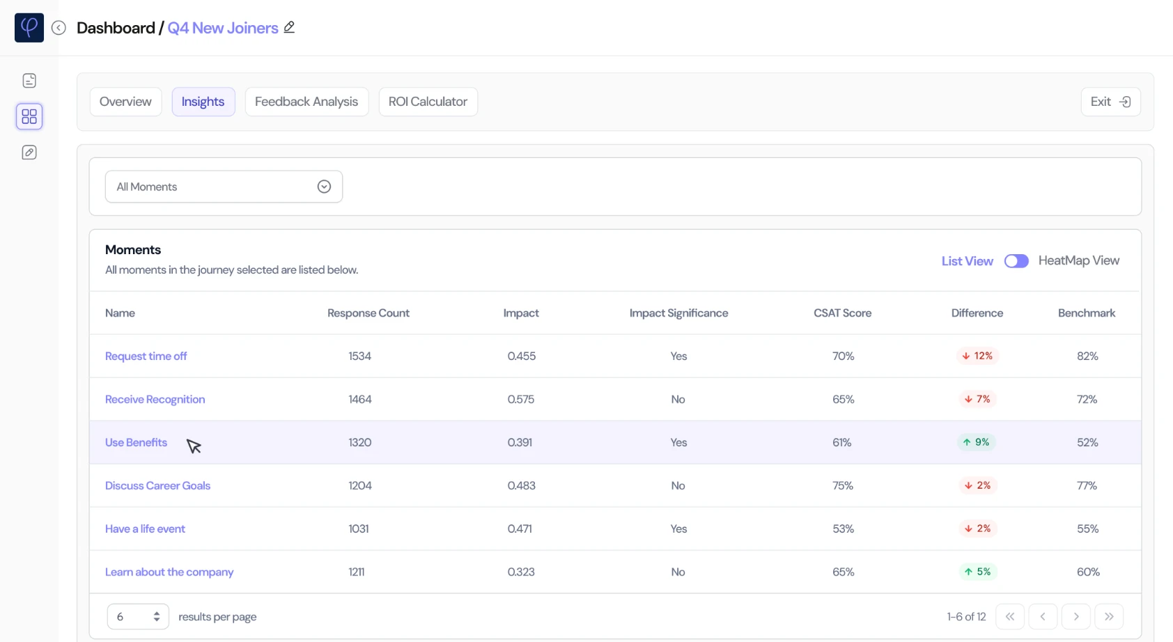
Answers are grouped into a journey, like Q4 new joiners, then into the moments inside it, like meeting the team or requesting time off.
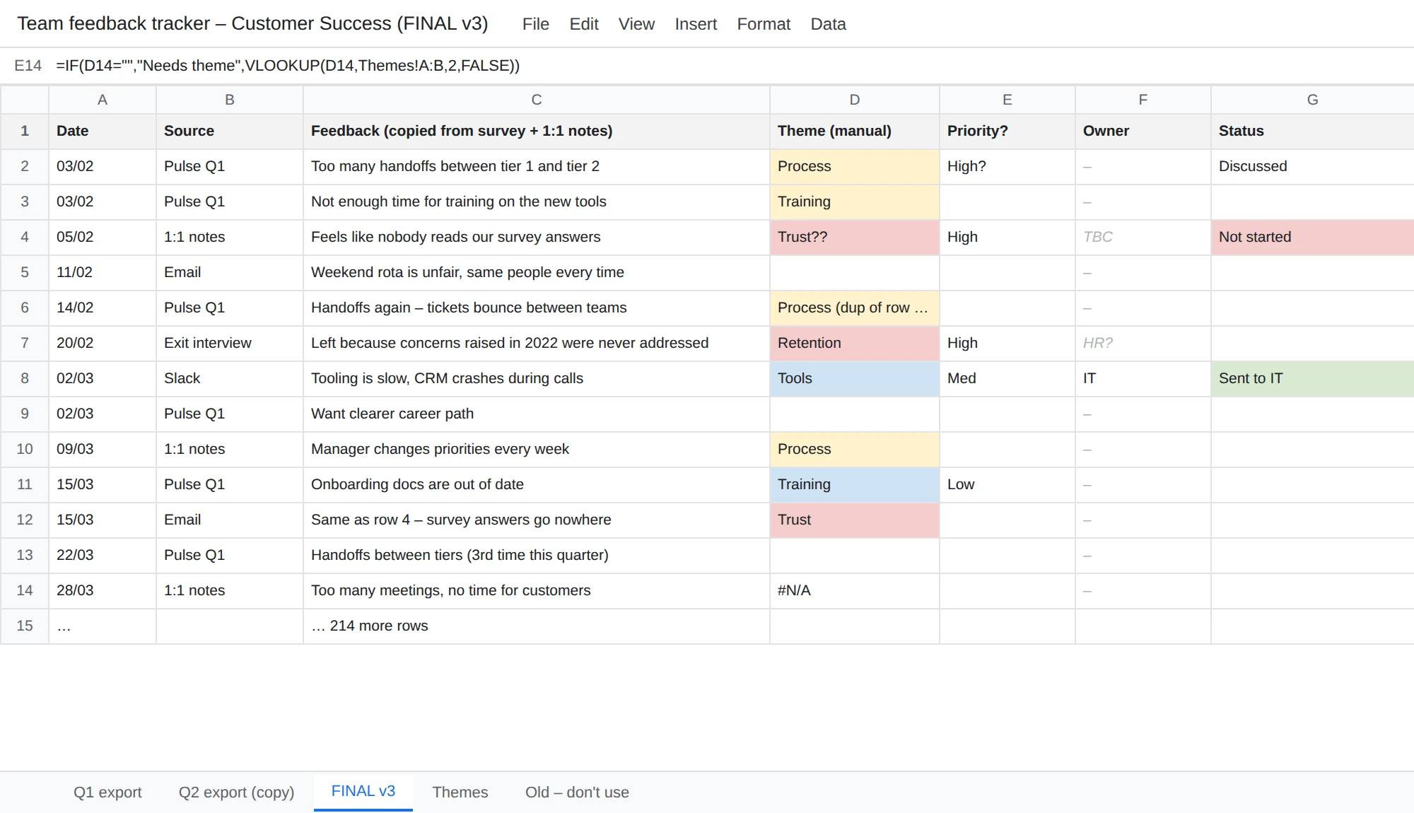
Before
Feedback copied into spreadsheets by hand, themes guessed, and no way to tell which problem mattered most.
An illustration of the old way, recreated for this case study.
Now
One overview of the journey, then a heatmap and a key driver chart that show which moments to fix first.
1The overview
Hover a decision to see it in the designTap a decision to see it in the design
2Finding the moments that matterClick a tab to see each view and the decisions behind it
Hover a decision to see it in the designTap a decision to see it in the design
Hover a decision to see it in the designTap a decision to see it in the design
Hover a decision to see it in the designTap a decision to see it in the design
Hover a decision to see it in the designTap a decision to see it in the design
Heatmap: Every moment, compared across teams
3. Inside one moment
PrincipleKnow why, not just what
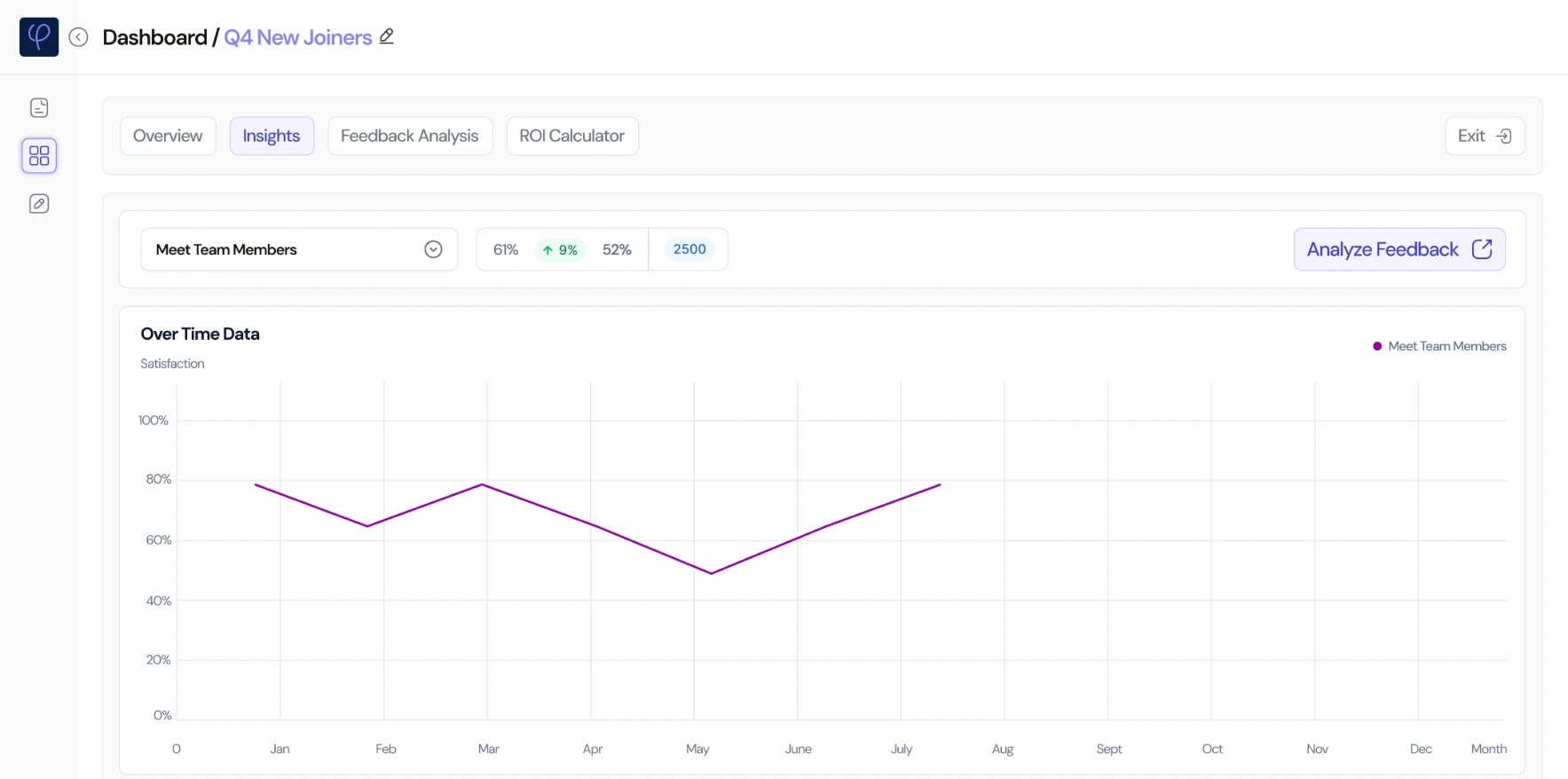
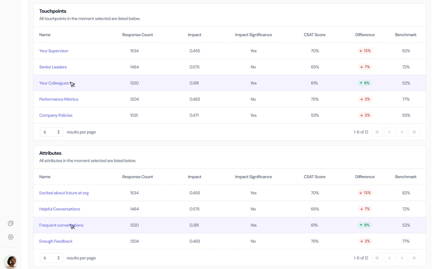
Each moment breaks down into touchpoints, the people and things that shape it, and attributes, what people actually felt.
Before
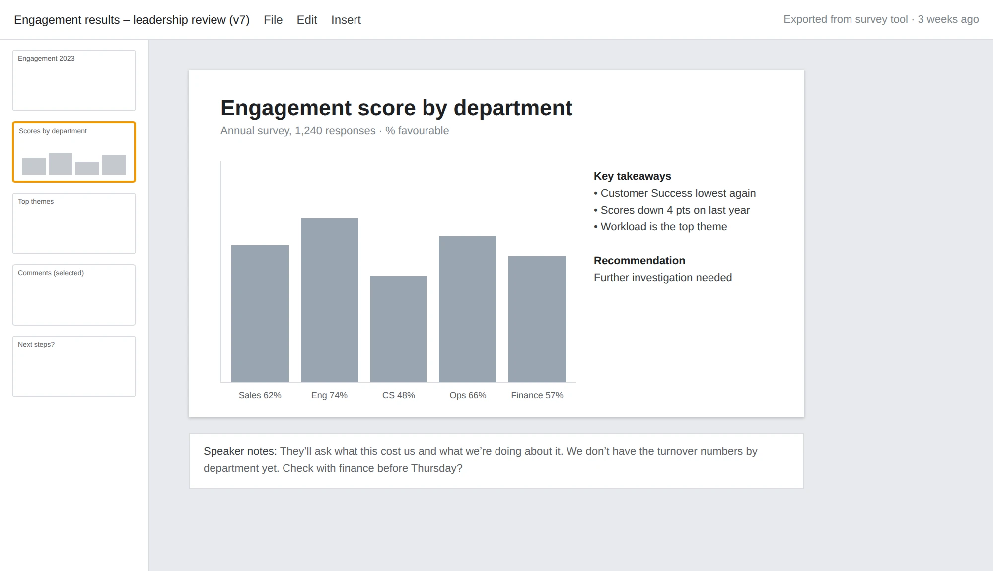
A slide with a chart and “further investigation needed”. Leadership saw what was low, but never why.
An illustration of the old way, recreated for this case study.
Now
Every moment shows its trend, the touchpoints and attributes behind it, how each compares to the benchmark, and the comments behind the numbers.
1One moment, in depthClick a tab to see each view and the decisions behind it
Hover a decision to see it in the designTap a decision to see it in the design
Hover a decision to see it in the designTap a decision to see it in the design
The moment: Meet team members: its score and trend
A year later: what was still slow
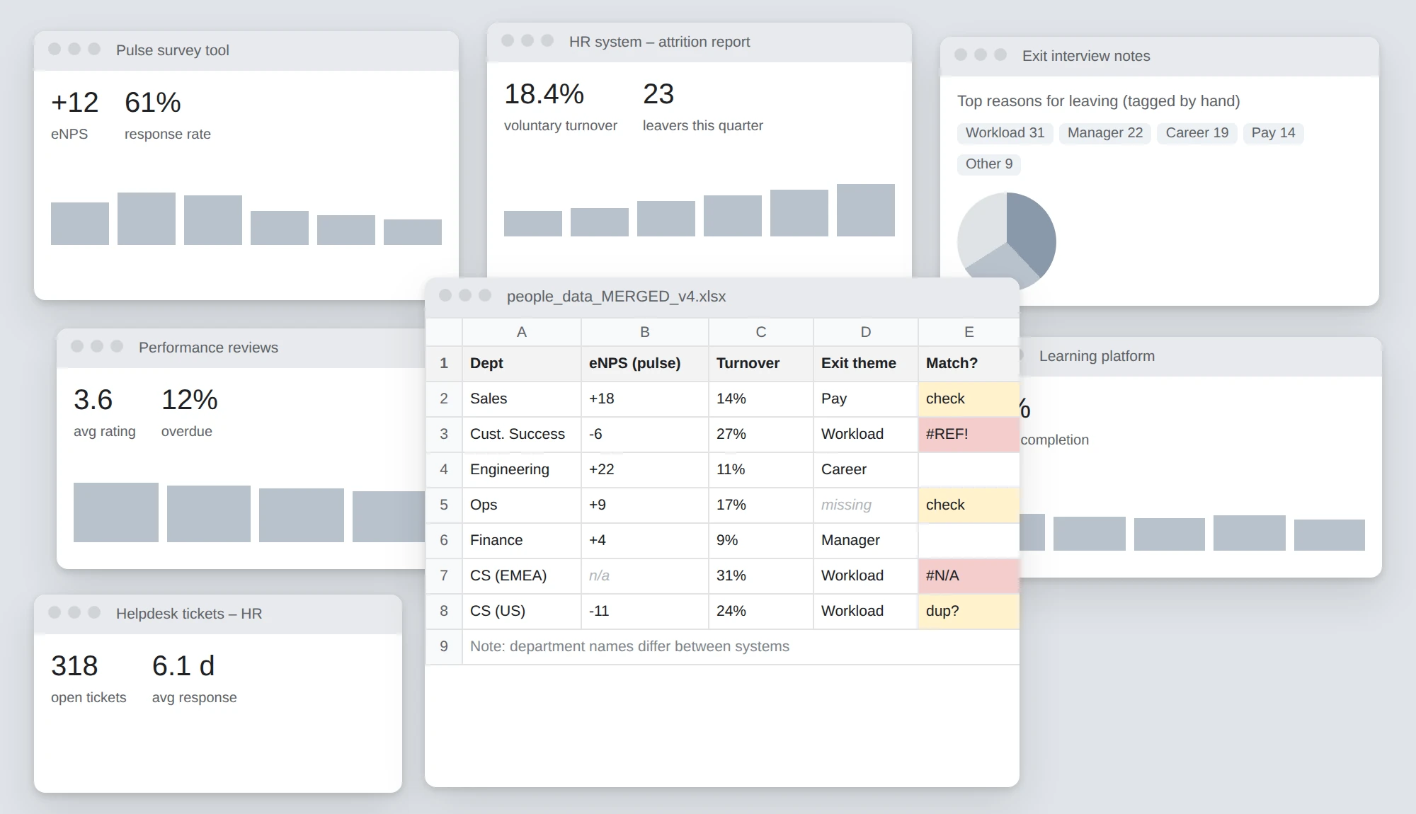
Fount worked, and people used it. A year of real use also showed where the work was still slow. The feedback was coming in, but HR teams were drowning in it:
Scattered
5 to 8 platforms
Employee feedback was spread across five to eight different tools.
Stuck in analysis
73% of HR leaders
spent more time analysing data than acting on it.
Too late
6 weeks
On average, that’s how long it took to spot an issue after it started.
So I ran a second round of research over three weeks: 18 HR directors and VPs, 12 People Operations managers, 9 team leads and 4 C-suite executives.
“I feel like I’m always putting out fires instead of preventing them. By the time we see patterns in our data, the damage is already done.”
People Leader, manufacturing company
That was a real need, and a business opportunity, so we built Fount AI.
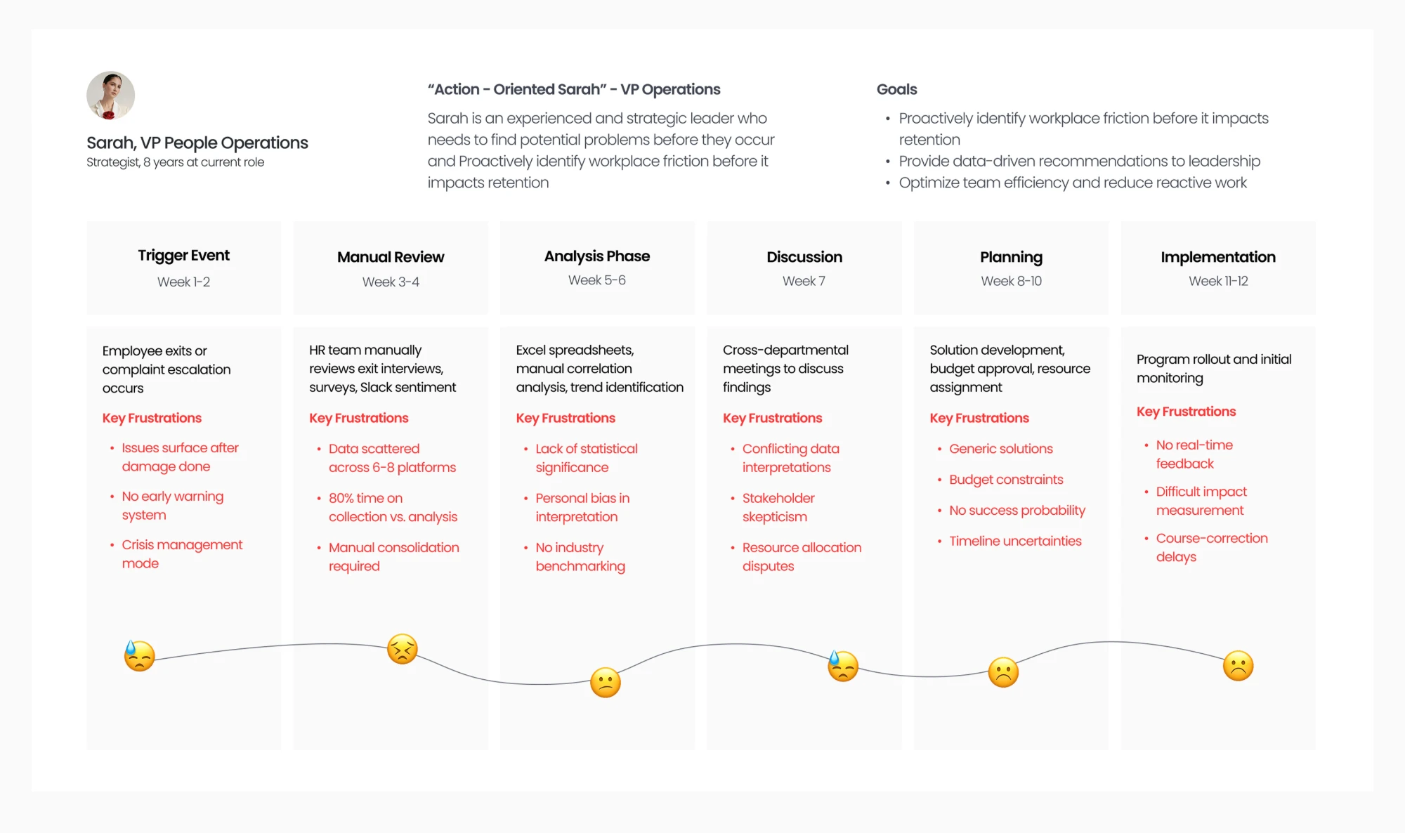
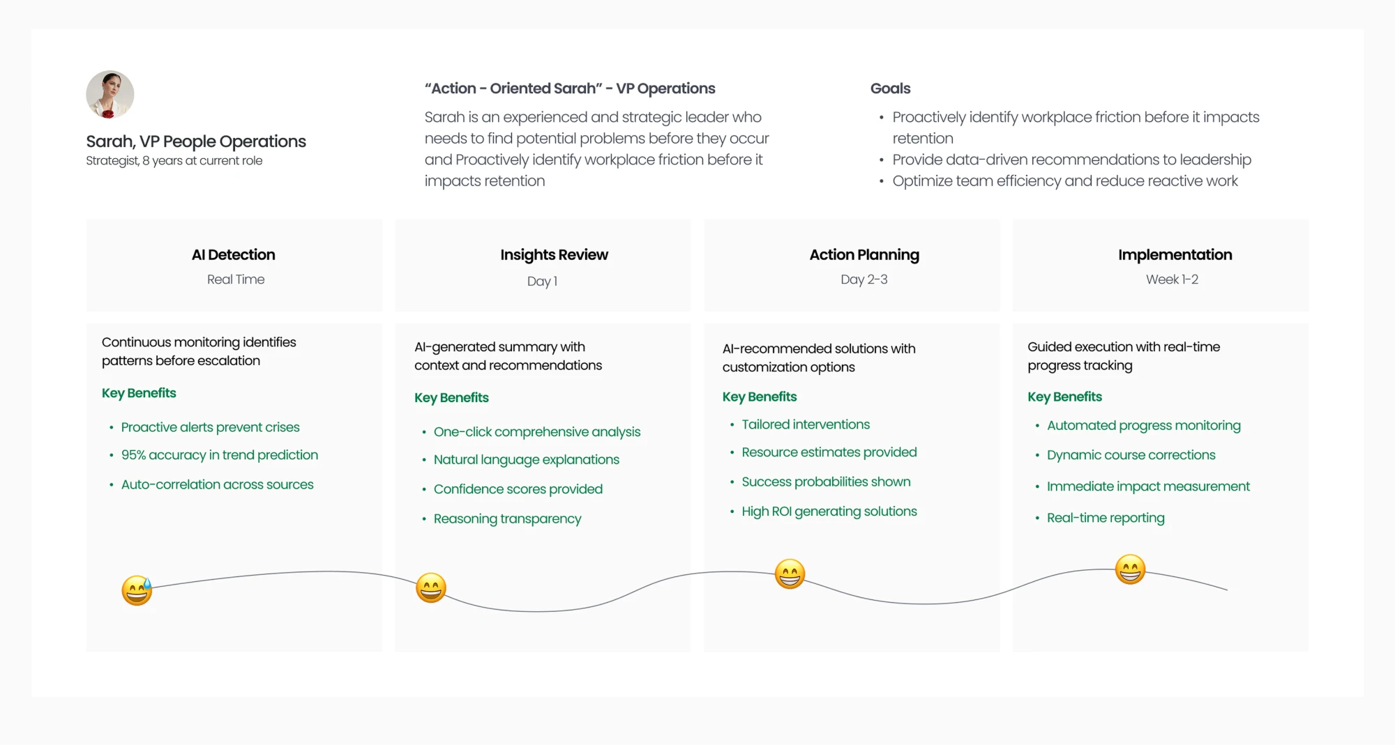
The journey, before and after Fount AISarah, a VP of People Operations, from spotting a problem to solving it. Switch between them with the tabs.
Hover a decision to see it in the designTap a decision to see it in the design
Hover a decision to see it in the designTap a decision to see it in the design
Before Fount AI: twelve weeks from a problem to a fix
Act 2 · Fount AI: a business partner for HR
Fount AI finds friction early across different sources of feedback and recommends what to do next, backed by employee data and proven practice. Three strategic calls shaped it:
Strategic call 1
Help people decide, don’t decide for them.
HR is accountable for its decisions, so full automation was the wrong tool. Fount AI asks before it acts, and its answers show the comments and sources behind them.
Strategic call 2
Answer “what should I do next?”
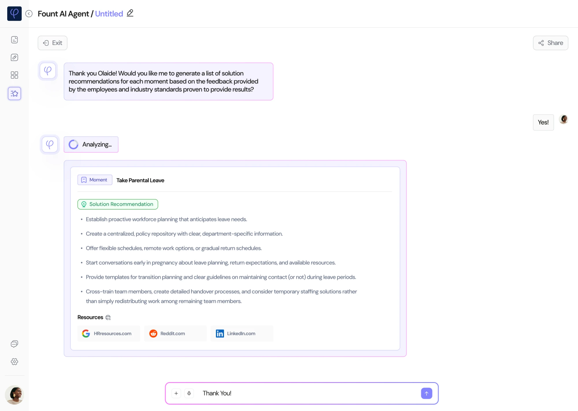
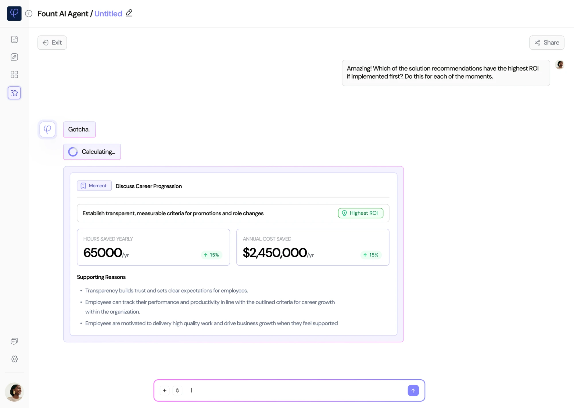
People kept asking for next steps, not more charts. So Fount AI suggests fixes for each moment, then ranks them by return, so HR knows where to start.
Strategic call 3
Speed up the slow middle.
The longest wait was between finding a problem and acting on it: working out which fix would pay off most, and preparing material leadership would trust. Fount AI does that work: it ranks the fixes by return and gives HR the reasons to take to leadership. Customers were also ready to pay thousands more for it in their enterprise deals.
4. Ask Fount AI
PrincipleA conversation, not another dashboard
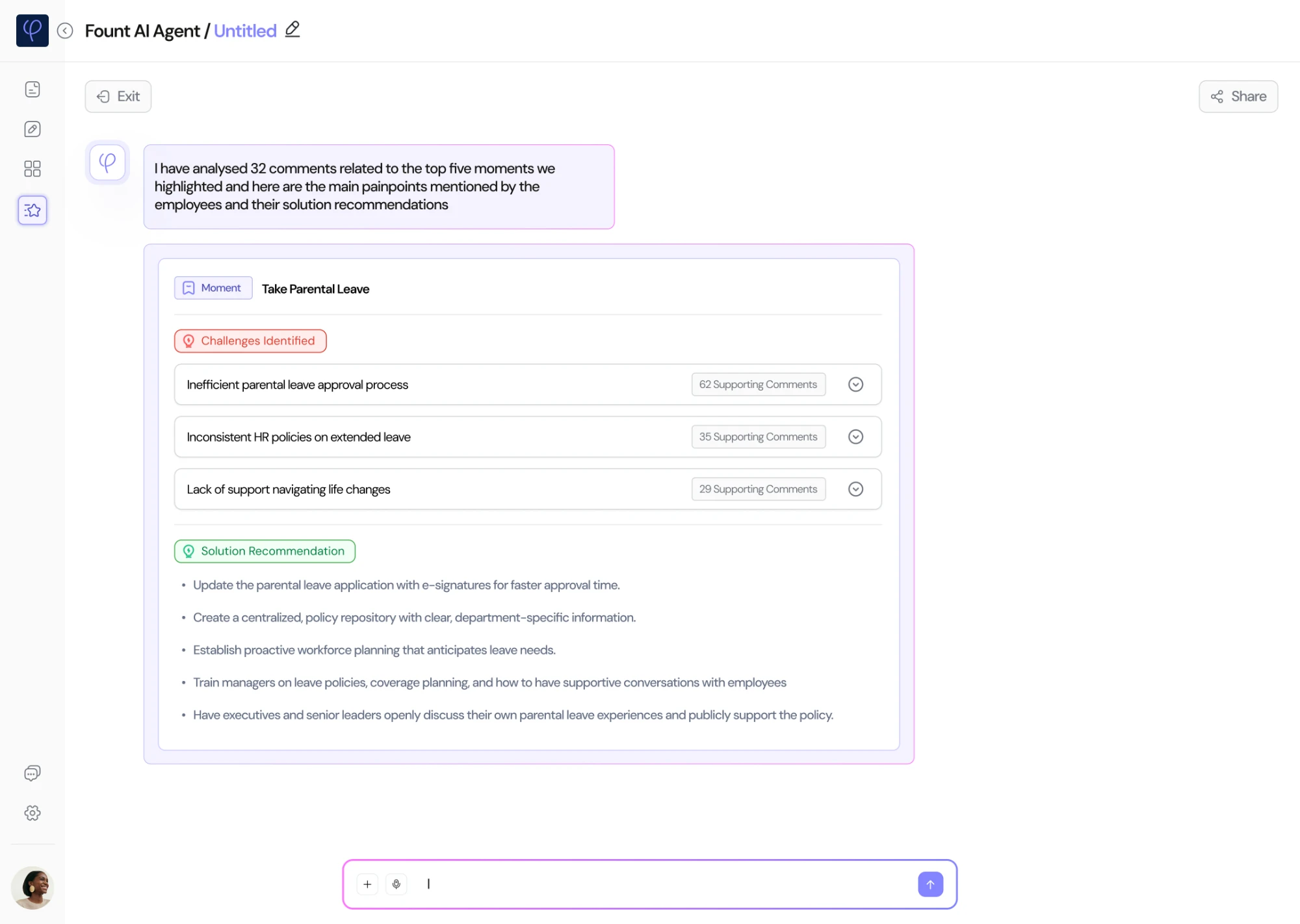
HR asks in plain words. Fount AI reads the comments behind the moments that matter most, names the main problems, and suggests what to do.
Before
HR checked six dashboards a day and pulled data into Excel to find patterns.
An illustration of the old way, recreated for this case study.
Now
Ask a question and get the main problems, the comments behind them, and fixes with their sources.
1One conversationClick a tab to follow the conversation, and see the decisions behind each answer
Hover a decision to see it in the designTap a decision to see it in the design
Hover a decision to see it in the designTap a decision to see it in the design
The problems: What employees are struggling with, and the proof
5. What to fix first, and why
PrincipleHelp people decide
Knowing what to do isn’t enough when budgets are tight. HR has to know what to do first, and be able to defend it.
Before
Dashboards showed what was happening, but not what to do about it, or where to start.
An illustration of the old way, recreated for this case study.
Now
For each moment, Fount AI picks the fix with the highest return, shows the hours and money it saves, and explains why.
1The highest return first
Hover a decision to see it in the designTap a decision to see it in the design
The highest return first: the top fix for one moment, and why
Tested with the people who’d use it
I tested both products with the people they were for, at INGKA and beyond. The clearest request came in the AI round: customers wanted the biggest problems first, then the comments. That’s how Fount AI answers, starting with the top five moments.
Fount
18 + 9
employees at INGKA, plus 9 participants from other organisations and our internal stakeholders
Fount AI
24 + 23
people at INGKA, plus 23 participants from other organisations
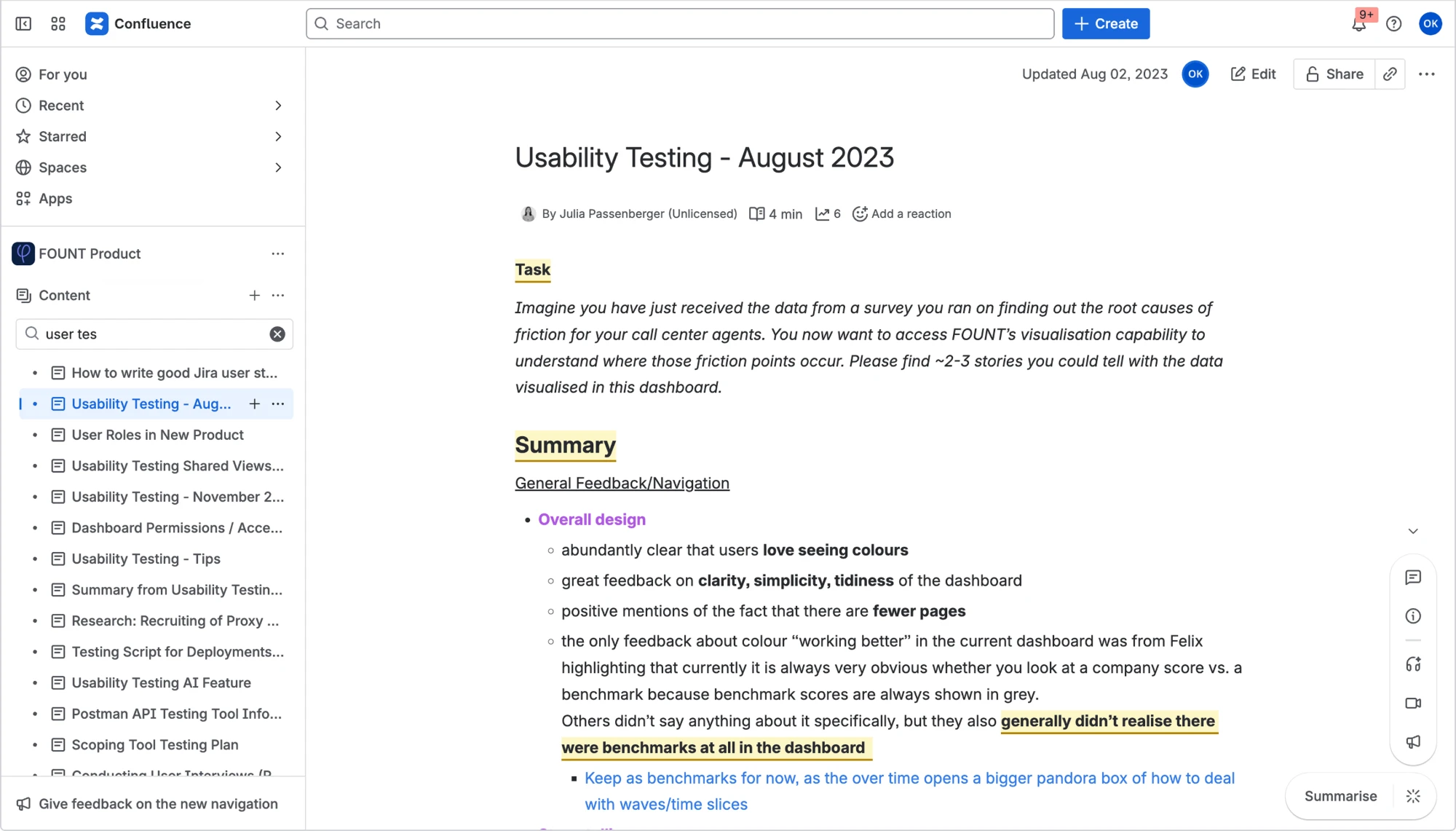
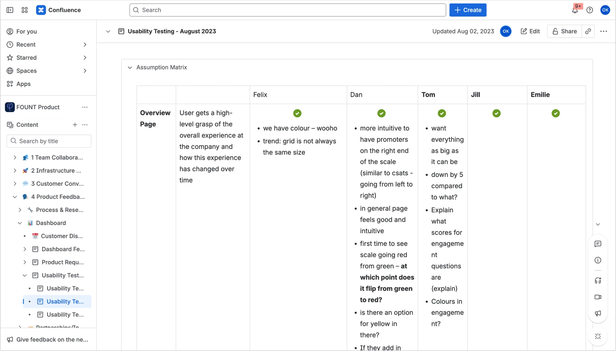
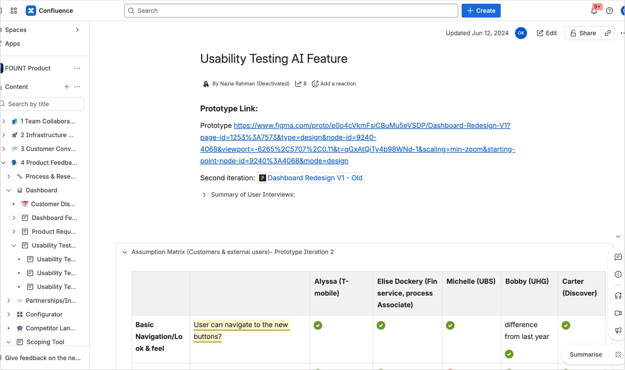
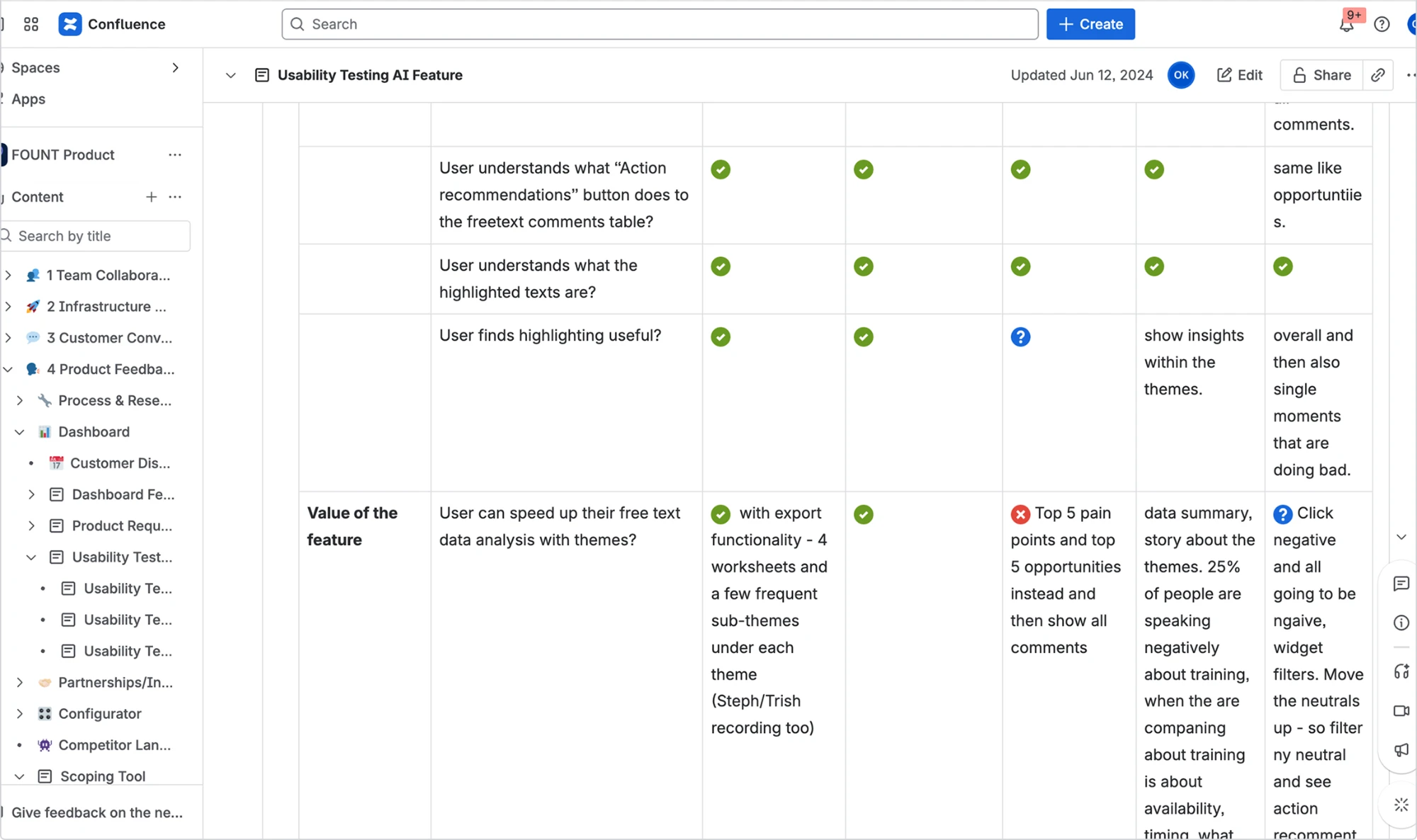
Usability testing, both productsFount’s dashboard in August 2023, then the AI features with customers. Switch between them with the tabs.
Hover a decision to see it in the designTap a decision to see it in the design
Hover a decision to see it in the designTap a decision to see it in the design
Hover a decision to see it in the designTap a decision to see it in the design
Hover a decision to see it in the designTap a decision to see it in the design
Fount: findings: the August 2023 write-up, with a real task and what we decided
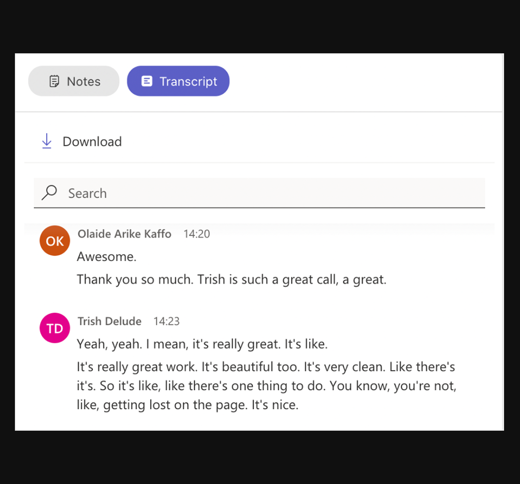
“It’s really great work. It’s beautiful too. It’s very clean… You’re not getting lost on the page.”
Trish Delude, Customer Success Manager
Feedback that finally led somewhere
Most employees took part every week, and feedback turned into action. These were shared results. My part was designing a loop people trusted enough to use.
Participation
81%
average weekly participation in micro-surveys
Fount, after 12 months
Follow-through
63%
of friction points had an action plan within 30 days
Fount, after 12 months
Fount AI
6.2 → 1.4 wks
from spotting an issue to resolving it
After 3 months
Business
$3M+
revenue in year one
Fount only
How we measured: our customers reported these results while we ran sprints alongside them, helping their teams use the platform.
Use stayed high: 91% of employees used Fount at least once a month, and 74% of managers checked their dashboard every week. We sold Fount AI on top of Fount, as an add-on for every enterprise customer, priced by contract.
Fount AI, after 3 monthsMeasured with our customers after three months of use.
Time from spotting an issue to resolving it77% faster
Before
6.2 weeks
With Fount AI
1.4 wks
HR time spent analysing data, each week79% less
Before
14 hours
With Fount AI
3 hrs
What people said
Customer success worked closest with our clients, so their view mattered most.
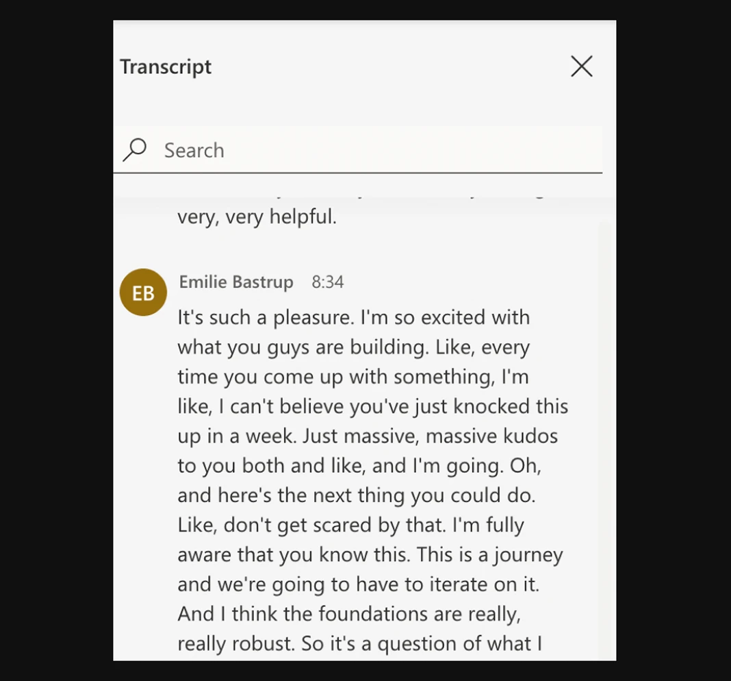
“I’m so excited with what you guys are building… I think the foundations are really, really robust.”
Emilie Bastrup, Head of Customer Success
From the meeting transcripts, unedited
What this project shows about how I work
I design the loop, not the survey.
Four causes pointed to one idea: feedback has to visibly lead somewhere. Every feature closed part of that loop.